Scatter plots effectively visualize the relationship between two variables, vital for data analysis in business, science, and education. Microsoft Excel provides an easy way to create a scatter plot with 2 variables. This article discusses a step-by-step guide to creating a scatter plot in Excel when the variables are adjacent. It also covers how to handle non-adjacent variables in your dataset.
➤ Select the data where you want to create a scatter plot.
➤ Go to the Insert tab >> Charts ribbon group >> pick the first option from the drop-down list of the Insert Scatter (X, Y) or Bubble Chart option.
➤ Customize your chart for better visualization.
In this article, you’ll get the process of how to create a scatter plot in Excel with two adjacent or non-adjacent variables with real-world examples.
Create a Scatter Plot with Two Adjacent Variables
When you have two continuous and adjacent variables in your dataset, you might follow these steps.
Step 1: Organize the Data Properly
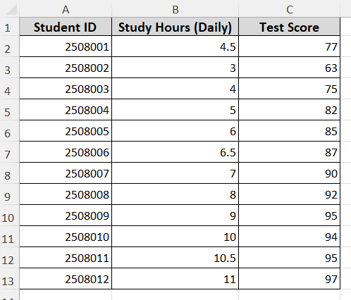
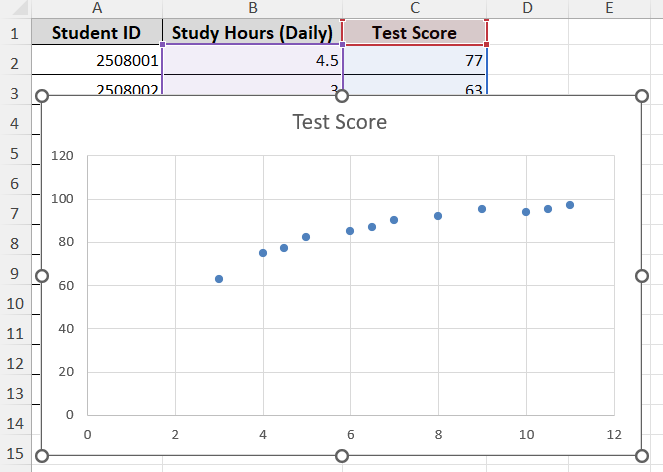
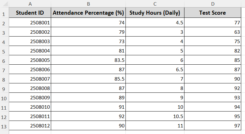
Let’s get an overview of the dataset first. This dataset shows student IDs, study hours, and test scores. We want to see the impact of study hours on test scores by creating a scatter plot.
Note:
Create a scatter plot when both variables are continuous and numeric. Place the independent variable (“Study Hours”) in the left column and the dependent variable (“Test Score”) in the right column.
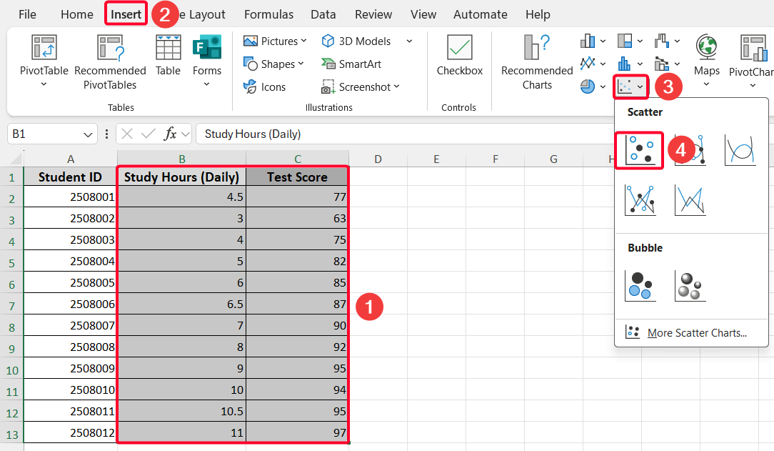
Step 2: Select Data & Insert Scatter Plot
➤ Select two variables (B1:C13 cell range).
➤ Go to the Insert tab >> pick the Scatter option and select the first thumbnail from the Charts ribbon group.

This will create the scatter plot shown below.
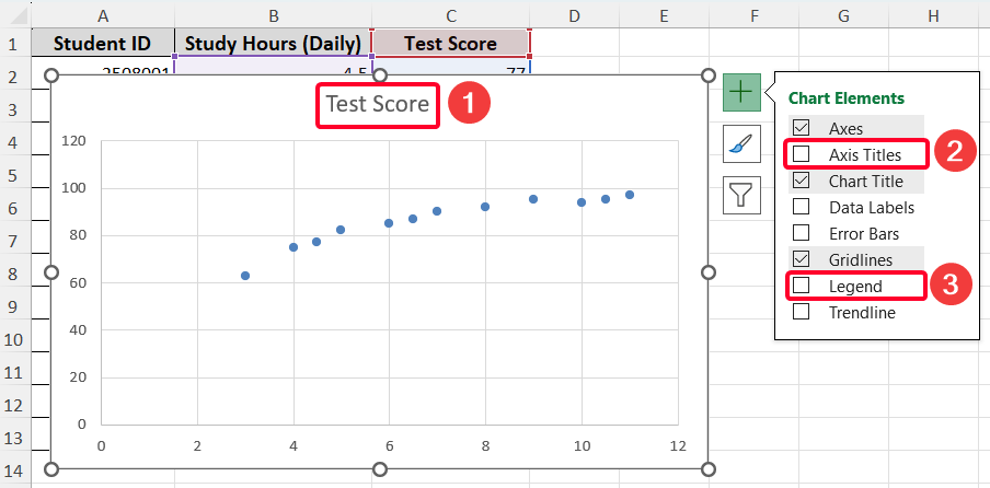
Step 3: Customize the Created Scatter Plot
Now, it’s time to customize your scatter chart for better visualization. Here, you’ll learn how to add axis titles & legend, modify legend text, and add a trend line to the plot.
Add Axis Titles & Legend
➤ First modify chart titles (“Study Hours vs. Test Scores”)
➤ Then ensure the checkboxes for Axis Titles and Legend are checked.
➤ Adjust axis labels (“Study Hours” for the X-axis and “Test Scores” for the Y-axis).
After doing that, the scatter plot will look like the one below.
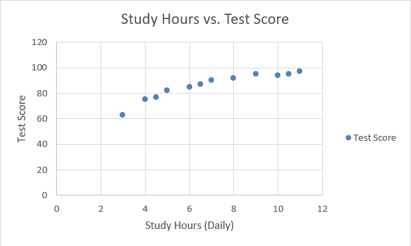
Change Legend Title
If you look at the previous image closely, you’ll notice the legend title is incorrect. Hence, we need to change the legend title.
➤ Click on the legend.
➤ Right-click and pick the Select Data… option from the context menu.
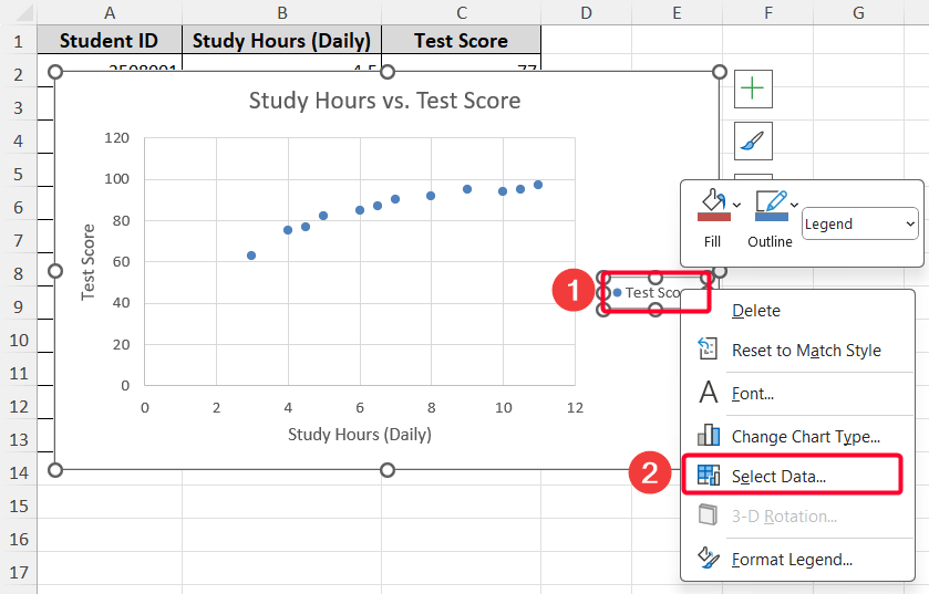
➤ Go to the Edit option.
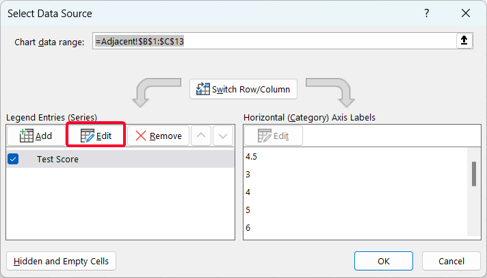
➤ Modify the series name as “Study Hours vs. Test Score” and press OK.
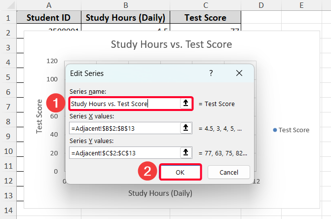
➤ Press OK again.
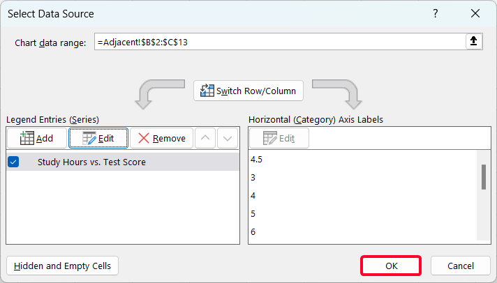
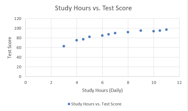
Then the scatter plot looks like the following.
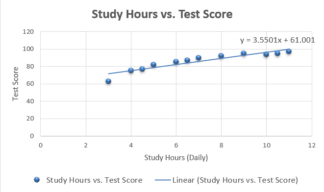
Add Trend Line
To see the trends of your data, you can add a trend line with the equation.
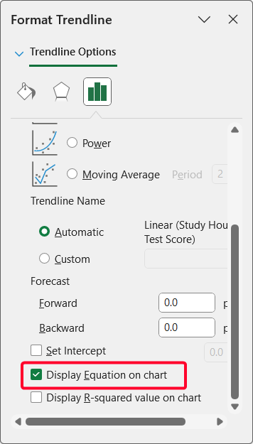
➤ Select the plot >> click on the plus icon >> pick More Options… from the Trendline option.
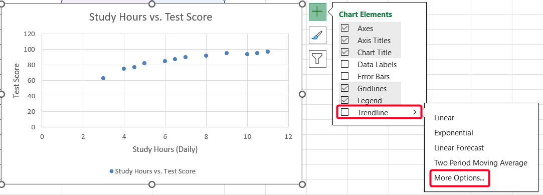
➤ Check the box before the Display Equation on chart option.
The final scatter plot will look like this:
Note:
Also, you can change chart styles from the Chart Design tab, if needed.
Make a Scatter Plot with Two Non-adjacent Variables
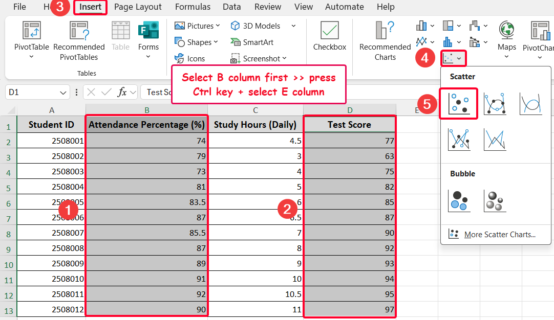
When you have two non-contiguous variables in your dataset, you can also create a scatter plot. Here, I’ve added an “Attendance Percentage” variable (column B) to the existing data. I would like to create a scatter plot of attendance percentage versus test score.
➤ Select column B first >> hold the Ctrl key + select the non-adjacent column E.
➤ Go to the Insert tab >> pick the Scatter option from the Charts ribbon group.
Soon, you’ll get the following output.
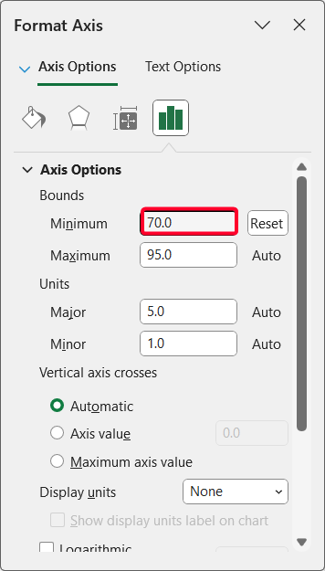
As you see in the above chart, the data looks congested. To make the plot look clearer, do the following things.
➤ Select the X-axis >> Right-click and select the Format Axis.. option from the context menu.
➤ Set the Minimum value is 70 or below to spread out data points for clarity
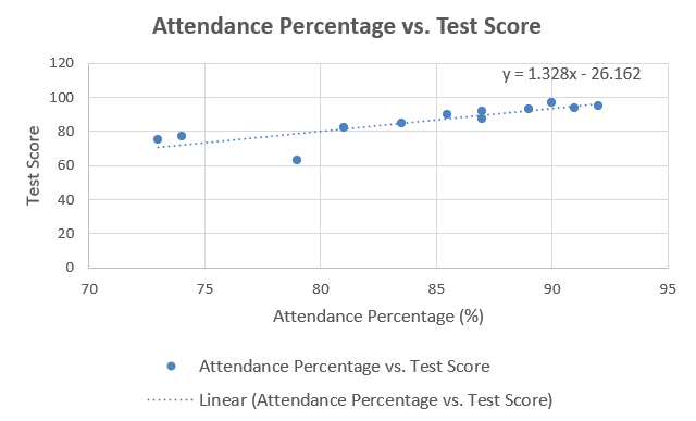
After that, customize the created scatter plot as we did in step 3 of the previous section. Now the scatter looks better.
Frequently Asked Questions
Why is one of my variables not showing on the chart?
Ensure both variables are numeric and properly selected. Blank cells or text values can prevent proper plotting.
How to create a scatter plot in Excel with 3 variables?
First, select the data and choose the ‘Scatter with Smooth Lines and Markers’ or ‘Scatter with Straight Lines’ thumbnail from the Charts ribbon group.
Is there a shortcut to create a scatter plot in Excel?
After selecting your data, press Alt + N + S + C to quickly insert a basic scatter plot if you’re a Windows user.
Wrapping Up
Creating a scatter plot in Excel with two variables is a simple way to visualize relationships in your data, whether your variables are adjacent or non-adjacent. This article helps you insert a scatter plot and customize it with axis titles, legends, and a trend line. Feel free to download the practice workbook and share your thoughts in the comments!