A scatter plot in Excel is a powerful tool for identifying relationships between variables, analyzing data patterns, detecting outliers, conducting trend analysis, and comparing data sets. Whether you’re a researcher, professional, or data enthusiast, a scatter plot will give you visual insights. In Microsoft Excel, you can create a scatter plot using either two variables, a single data series, or two data sets. This article provides a step-by-step guide on the way to make a scatter plot in Excel with two sets of data.
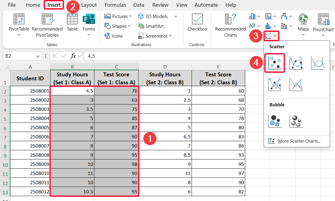
➤ Select your sets of data from where you want to create a scatter plot.
➤ Go to the Insert tab >> Charts ribbon group >> pick the first option from the drop-down list of the Insert Scatter (X, Y) or Bubble Chart option.
➤ Customize your chart for better visualization.

In this article, the first set of data will be used to demonstrate how to make a scatter plot, followed by the second set of data. The final step will show you how to alter the generated chart to improve visualization.
What Is a Scatter Plot?
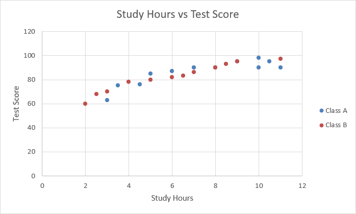
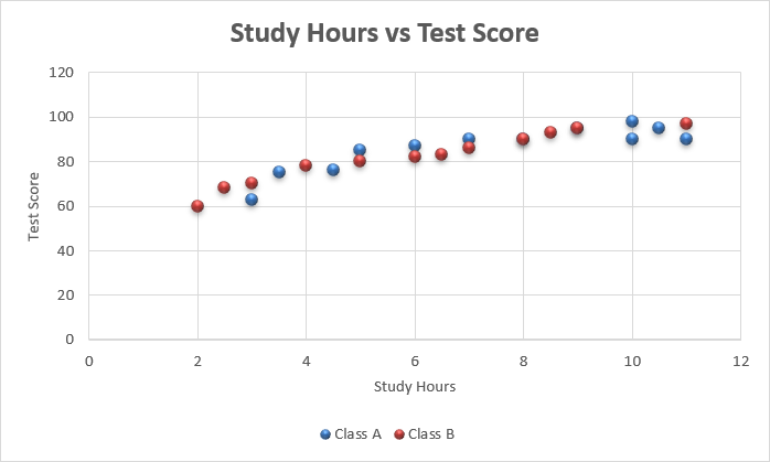
A scatter plot is a chart type that displays the relationship between variables. It is also called a scattergram, scatter graph, or scatter chart. The data points or dots on a scatter plot represent individual values of each data point and help identify patterns when viewing the data as a whole. The below scatter plot represents the comparative analysis of Class and Class B regarding the impact of study hours on the test scores of students.
Applications of Scatter Plot in Excel
- Identify the relationship between variables: We can use a scatter plot to show the relationship between dependent and independent variables. For example, if you want to see the impact of study hours on test scores, use a scatter plot.
- Determine correlation: Plotting sales revenue (X-axis) against advertising budget (Y-axis) to see if higher spending correlates with higher sales.
- Finding data patterns and trend analysis: You might use temperature (X-axis) and precipitation (Y-axis) data to see the patterns and trends of precipitation depending on the temperature in a region. Also, you can easily find any outlier point using this chart.
- Comparing two sets of data: If you have two sets of data for comparative analysis, you can easily use a scatter plot. This article discusses this application thoroughly, where we will see the difference between students of Class A and Class B regarding the impact of study hours on their test scores.
Steps to Make a Scatter Plot with 2 Sets of Data in Excel
Step 1: Organize the Data Properly
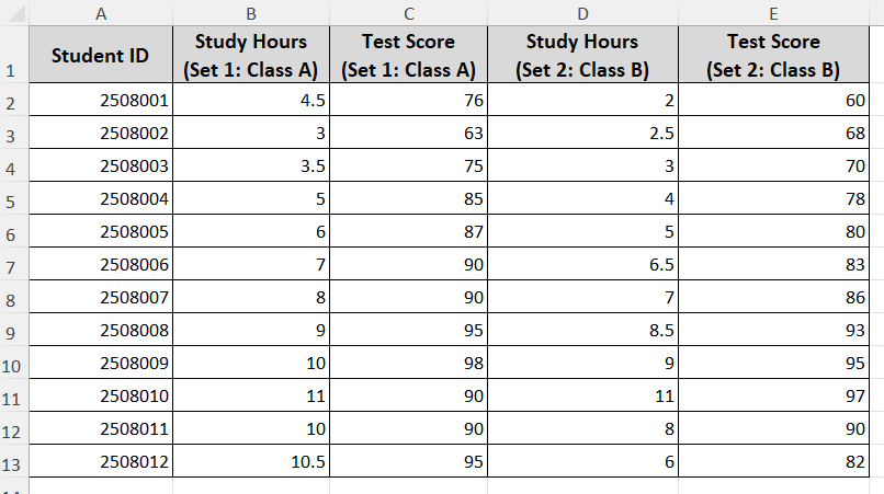
Let’s get an overview of the dataset first. The following dataset contains two sets of data: the first includes study hours and test scores for Class A, and the second includes the same for Class B. We aim to see the impact of study hours on test scores for both classes by creating a scatter plot.
➤ Keep your independent variable (“Study Hours”) in the left column and the dependent variable (“Test Score”) in the right column, and
➤ Check data format. Ensure your data is numeric, with no blank cells, text, or errors, as Excel may misinterpret non-numeric values
Step 2: Insert the Scatter Plot of the First Set of Data
As we have two groups of data, we will create the scatter plot sequentially. First, we will use the first set of data (Class A)
➤ Select two columns of Class A.
➤ Go to the Insert tab >> pick the Scatter option from the Charts ribbon group.
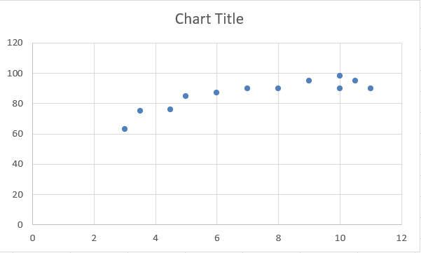
Meanwhile, you’ll get a scatter plot for Class A.
Step 3: Insert the Scatter Plot for the Second Set of Data
This time, you need to insert the second set of data (Class B). Unlike the previous way, you have to insert the Class B data, like the steps below.
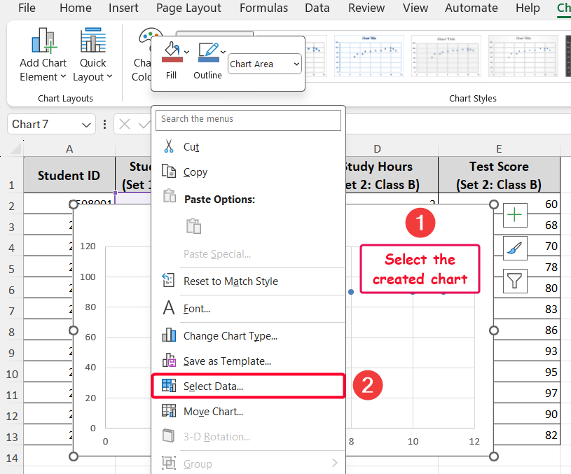
➤ Click the scatter plot created for Class A to select it
➤ Right-click on the chart >> select the Select Data… option from the Context Menu. Alternatively, you can pick this option from the Chart Design tab.
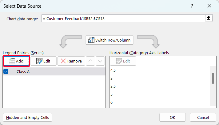
➤ From the Select Data Source window, click on the Series 1 >> go to the Edit option >> rename it as “Class A”.
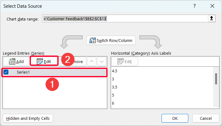
➤ Click on the Add option to insert the data of Class B.
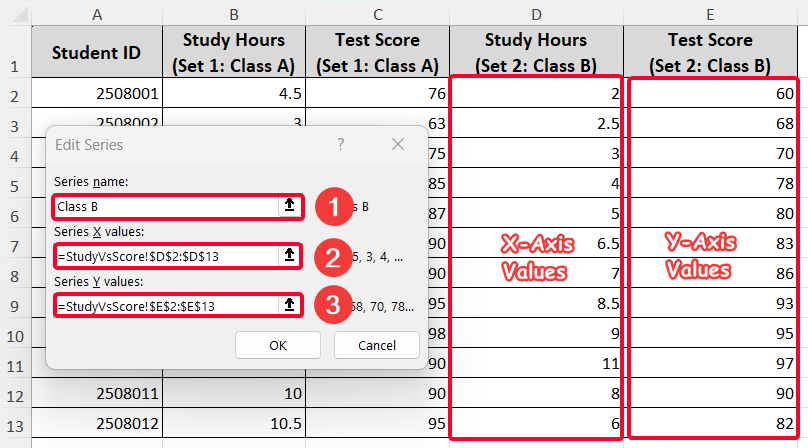
➤ In the Edit Series dialog box, make the Series name: as “Class B”.
➤ Insert the “Study Hours” column (D2:D13 cells) as X-axis values and “Test Score” column (E2:E13 cells) as Y-axis values.
➤ Press the OK button.
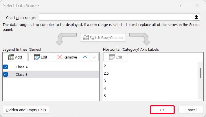
Thus, you’ll get a scatter plot including two sets of data (Class A & B).
Step 4: Customize Created Scatter Plot for Visualization
This is the last step where the scatter plot needs customization for a clear demonstration.
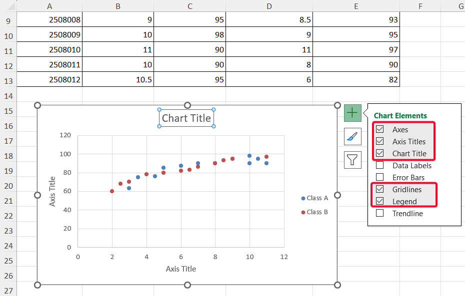
➤ First, ensure the checkboxes for Axes, Axis Titles, Chart Title, Gridlines, and Legend are selected.
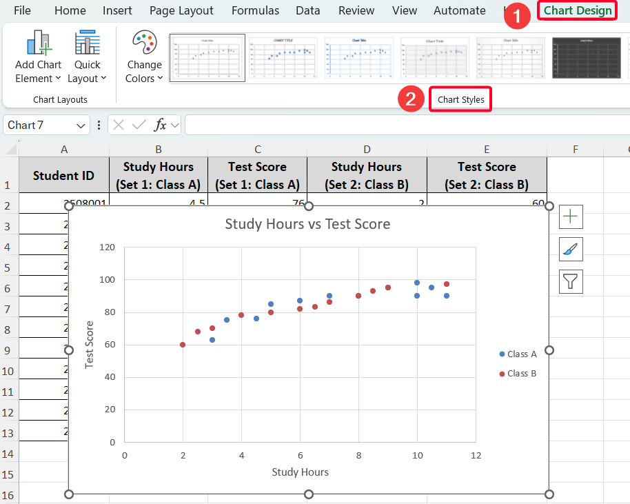
➤ Add chart titles (“Study Hours vs. Test Scores”) and axis labels (“Study Hours” for the X-axis and “Test Scores” for the Y-axis).
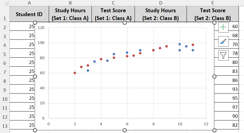
After doing that, the scatter plot would be like the following one.

➤ Also, you can change chart styles from the Chart Design tab, if needed.
The final scatter plot will look like this:
Frequently Asked Questions
Can I add more than two sets of data to a scatter plot?
Yes, you can add multiple series to a scatter plot by repeating the process of adding new series in the Select Data dialog box. Each series can have its own X and Y values, allowing you to compare several datasets on one chart.
How do I plot non-adjacent columns as X and Y?
Hold the Ctrl button while selecting your X and Y columns if they are not next to each other. Then insert the scatter plot as usual.
What should I do if my scatter plot button is grayed out?
This situation might happen when incorrect data formation exists or the worksheet is protected. In that case, you have to ensure the data formation and unprotect the worksheet.
Wrapping Up
This is how you can easily create a scatter plot in Excel with two sets of data for comparative analysis. We hope that you have enjoyed the article. Feel free to download the practice workbook and share your thoughts in the comments!