
A trendline shows the general direction of data points in a chart. Trendlines generally smooth out short-term fluctuations and reveal long-term patterns in a timeline. To add a trendline in Excel indicates adding single or multiple trendlines for a single or multiple series.
In Excel, there are six types of trendlines you can add in a chart. You can add them like any other chart elements: using the Chart Element button, the Chart Design tab and the context menu.
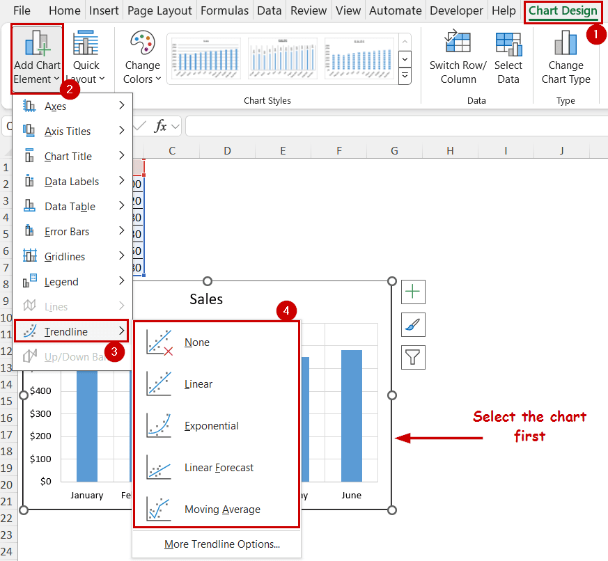
To add a trendline in Excel,
➤ Select the chart.
➤ Go to Chart Design >> Chart Layout (group) >> Add Chart Element >> Trendline.
➤ Then select the type of trendline you want to add to the chart.
This tutorial will explain how to add a trendline to a series in an Excel chart. We have split them into two sections. First, we will cover the general methods to add a trendline. Then we will go through how we can add multiple trendlines for a single series or different series.
Download Practice WorkbookQuick Video Tutorial: Add Trendline in Excel
Adding a Single Trendline in Excel
In this section, we will go over the main methods to add a trendline in Excel.
The data source contains monthly sales amounts, and the column reflects that.
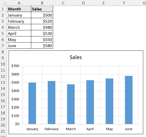
The chart contains one series – sales. We are going to plot a trendline for the sales in this column chart.
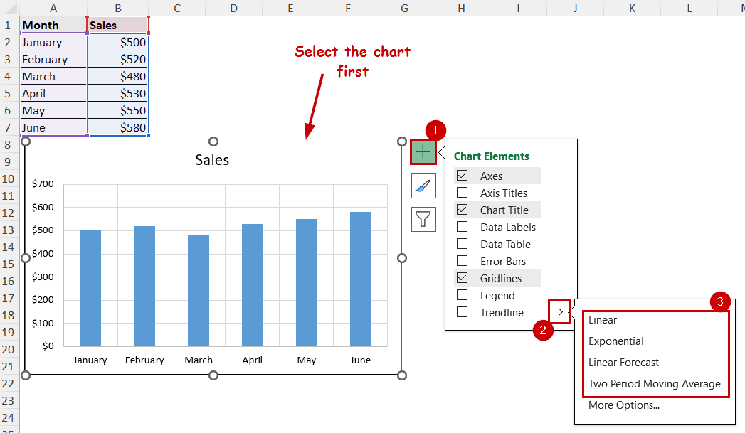
Using Chart Elements Button
The Chart Element button is the plus (+) shaped icon at the top-right of the chart. It appears after selecting the chart.
The button is available from Excel 2013 and is only available for the Windows version. We can quickly add, remove, or modify different elements using this button. That includes the trendline too.
Steps:
➤ Select the chart.
➤ Select Chart Element >> Trendline >> the type of trendline you want to insert.
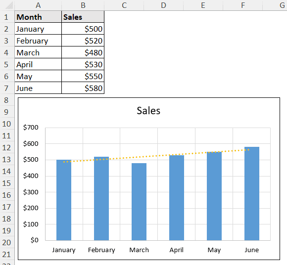
The chart will contain the type of trendline you choose.
Using Chart Design Tab
The Chart Design and Format tabs appear on the ribbon after selecting a chart.
The chart elements options are available in the Chart Design tab. You can use this method if you don’t have access to the Chart Element button (non-Windows or pre-2013 users).
Steps:
➤ Select the chart.
➤ Go to Chart Design >> Chart Layouts (group) >> Add Chart Element.
➤ Select Trendline from the dropdown.
➤ Then select the type of trendline you want to insert.
This is the same as the options available from the Chart Elements button and gives the same result. We are just accessing them differently.
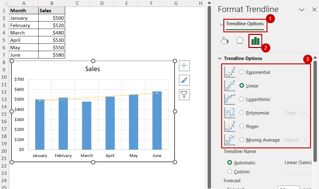
Using Context Menu
You can use the context menu to add a trendline in all versions of Excel, too.
However, to have the option to add a trendline, you need to right-click on top of a series (right-clicking on different places displays different options in the context menu).
Steps:
➤ Right-click on a data point or series.
➤ Select Add Trendline from the context menu.

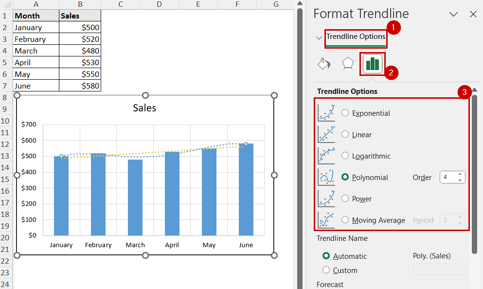
The Format Trendline pane will open on the sheet.
➤ Select the type of trendline from the Trendline Options of the Format Trendline pane.
Adding Multiple Trendlines in Excel
When you have different series in a chart, multiple trendlines are self-explanatory. They show the evolution of different trends over time.
For a single series, different trendlines can be helpful to analyze different models for trends. A suitable trendline makes future predictions much easier.
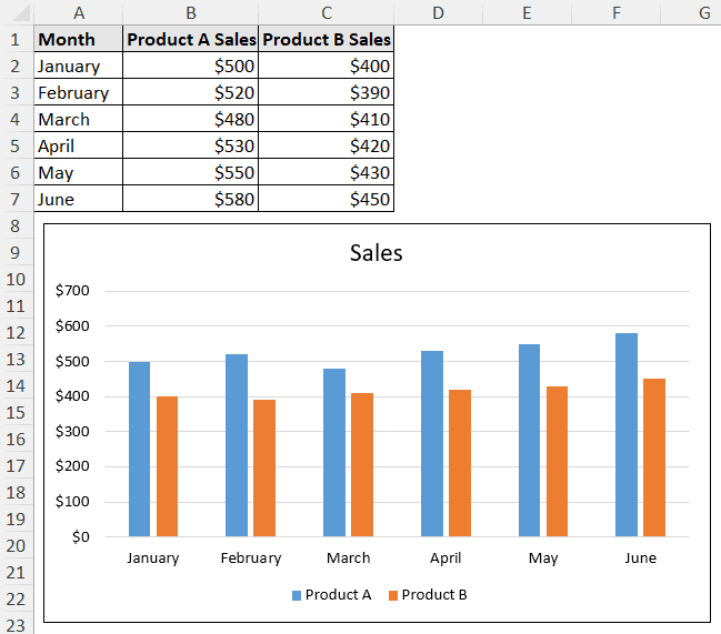
Adding Multiple Trendlines for Different Series
Now let’s consider two different products in our data source. The column chart would have two different series.
To add trendlines for different series like that in an Excel chart, you need to select them individually before inserting a trendline.
Steps:
➤ Select a series by clicking on it.
➤ Then insert a trendline using any of the methods.
For example, you can select Chart Elements >> Trendline >> the type of trendline.

➤ Now select another series.
➤ Repeat the process.
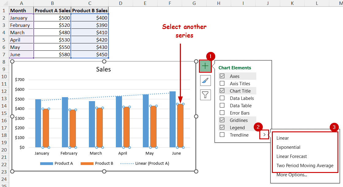
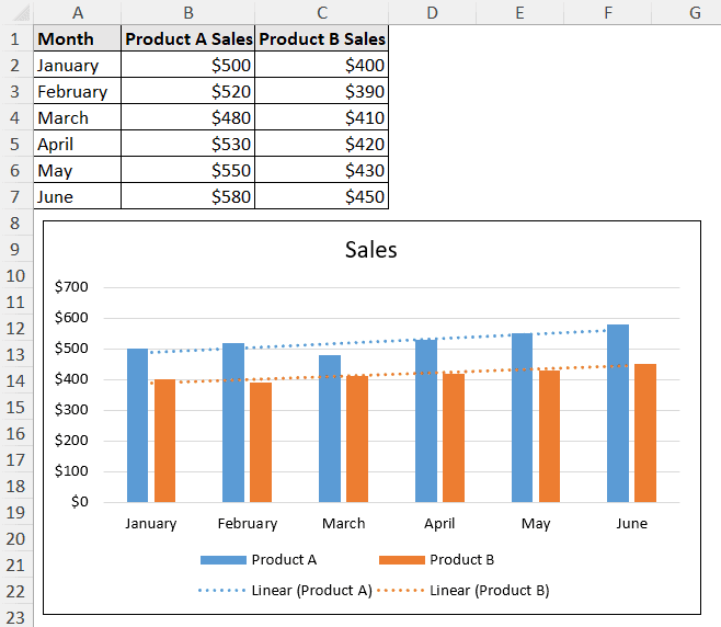
You can repeat the process for the number of series you have in the chart. Each column (or series) will have different trendlines.
Adding Multiple Trendlines for the Same Series
Multiple trendlines in a single chart can highlight both short and long-term trends.
For example, a linear trend shows a long-term upward or downward movement of the data. A moving average can show the fluctuations over a duration so that the short-term irregularities are more visible.
To create multiple trendlines for the same series, we need to deselect the chart and add a trendline again.
Steps:
➤ Right-click on the series and select Add Trendline from the context menu.
➤ Select the type of trendline from the Trendline Options of the Format Trendline pane.
We have modified the trendline so that it won’t match with more trendlines we will create.
➤ Right-click on the series again and select Add Trendline.

➤ Select a different type of trendline from the Format Trendline pane.
You can repeat this process for the number of trendlines you need.
Note: We have used the context menu to create trendlines in this demonstration. If you use the Chart Elements button or the Chart Design tab, you need to cancel the chart selection before adding trendlines again. You can do that by pressing Esc or clicking on a cell.
FAQ
Why won’t Excel let me add a trendline?
If you don’t have a graph without numeric data, Excel won’t have the trendline element available in any of the methods.
Pie, doughnut, radar, etc., aren’t designed to show trends and can’t have trendlines either. The options to add trendlines won’t be available for such charts in Excel.
How do I add a best fit line in Excel?
You can double-click on a trendline to open the Format Trendline pane. Type changing, customizations, forecasts, etc., options are available in the Format Trendline pane. Customize the trendline here to create a best-fit trendline for the chart in Excel.
How to show trend in Excel cell?
Excel has the Sparklines feature to show trend in a cell. To create sparklines, go to Insert >> Sparklines (group) >> Line. Then select the source and output cells in the dialog box.
The trend will be displayed in the output cells.
Concluding Words
In this tutorial, we have covered how to add the trendline in Excel. The article covered the general methods to add a trendline, and how to add multiple trendlines in the same and different series.
We can use the Chart Elements button, the Chart Design tab, and the context menu to add a trendline in Excel. Adding multiple ones involves using the same procedure repeatedly.
Feel free to download the practice workbook and give us your feedback.