You can understand complex information easily by using charts. Whether you’re working on a school report, a business dashboard, or a personal project, well-formatted charts help your data to understand easily. Charts are one of the best ways to visualize data. But simply inserting a chart isn’t enough. You need to format a chart to look clean, professional and visually appealing. In this article, I’ll show you step by step how to format charts in Google Sheets.
What is Chart Formatting in Google Sheets?
In Google Sheets, chart formatting means changing the look of the chart. Chart formatting is very important in Google Sheets because it improves the readability, clarity, and visual look of the data. In chart formatting, you can
- Change the chart type to a bar, column, line, pie, etc.
- Change axis labels and the chart title.
- Update or add titles,
- Customize chart colors,
- Add data labels
- Change the font, size, and color of titles and labels.
- Display or hide the legend
- Display the actual values on each bar or point
Add Data to an Existing Chart in Google Sheets
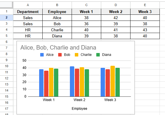
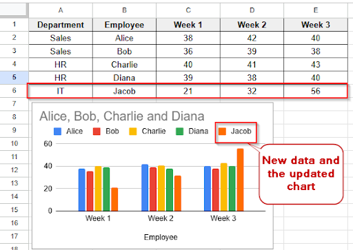
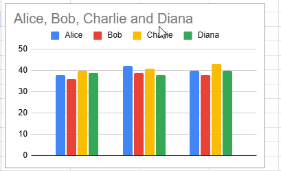
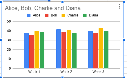
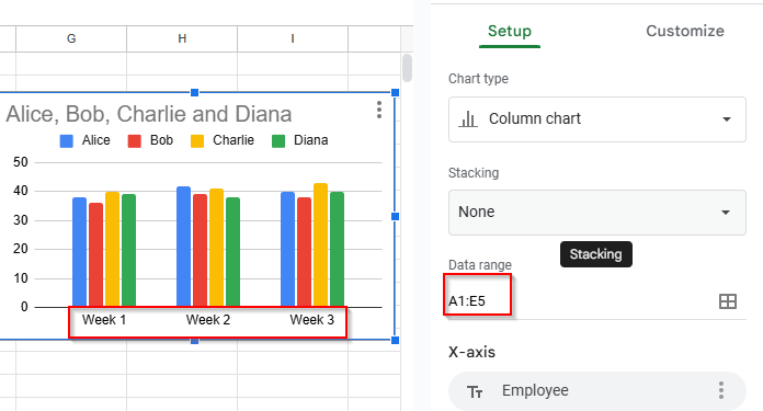
You can add new data to an existing chart in Google Sheets. You don’t need to create a new chart from scratch to show that data in a chart. Let’s look at the dataset and the column chart below, where the data range is A1:E5.
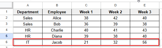
➤ Add new data in row 6
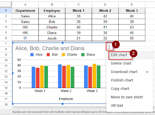
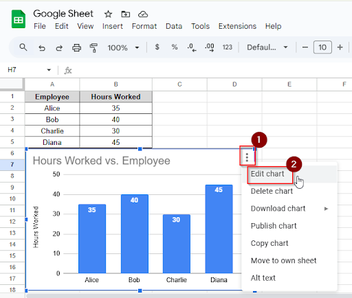
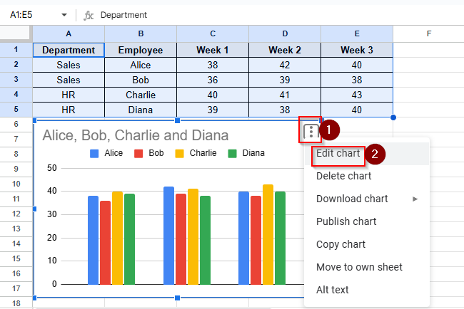
➤ Click on the chart to select it, click the three dots and then click the Edit chart option.
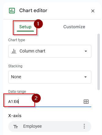
➤ Click the Setup panel and select the new data range A1:E6
➤ Now you can see the new updated chart with new data.
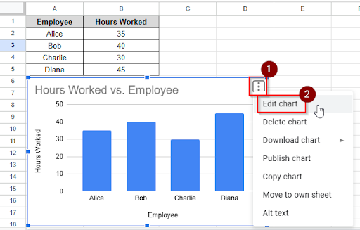
Add Data Labels in Google Sheets
When you are displaying each data point’s exact value directly on the chart, People can understand your data easily. Data labels make your chart easier to understand. You don’t need to guess any value. Everything is written clearly with data labels in the chart. Adding data labels in Google Sheets is very easy. Follow these steps to add data labels in Google Sheets.
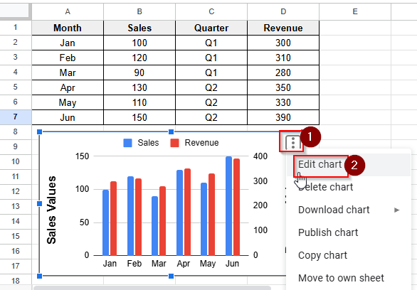
➤ Click on the chart to select it, click the three dots and then click the Edit chart option.
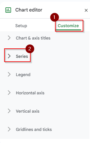
➤ Click on the Customize Tab and then click the series option.
➤ Check the box that says “Data labels.” You can also customize your data labels with data type, position, font, etc.
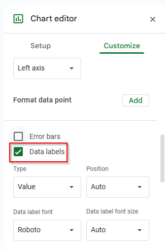
➤ Now you can see the values on each bar.
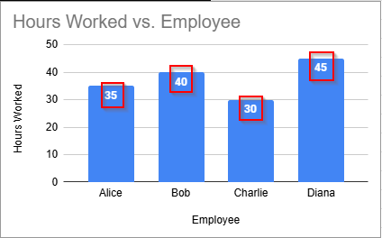
Add an X-Axis Label in Google Sheets
The X-axis label means the horizontal axis name. Adding an X-axis label helps to understand what the horizontal axis represents in the chart. You can add an X-axis label easily in the chart by following these steps.
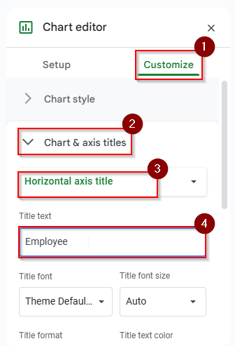
➤ Click on the chart to select it, click the three dots and then click the Edit chart option.
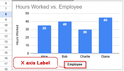
➤ Click on the customize > Chart & Axis Titles and then choose “Horizontal axis title”. Write the Title text “ Employee”. You can Customize the font, size, color, and format if needed.
➤ Now you can see the x-axis label is added in the chart
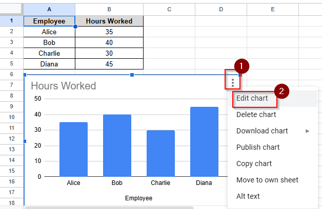
Add a Y Axis Label in Google Sheets
The Y-axis label refers to the title of the vertical axis. Adding a Y-axis label ensures that people can quickly understand the meaning of the numbers on your chart. When you’re tracking sales figures, student scores, or website traffic, it is important to add the y-axis label in the chart. Adding a Y-axis label is very easy in Google Sheets. Follow these steps to add a Y-axis label in Google Sheets.
➤ Click on the chart to select it, click the three dots and then click the Edit chart option.
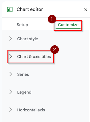
➤ Click on the Customize Tab and then click the chart & axis titles option.
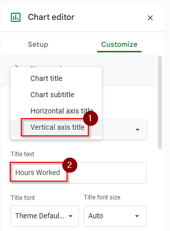
➤ Choose the vertical axis titles and write the title name “Hours Worked”
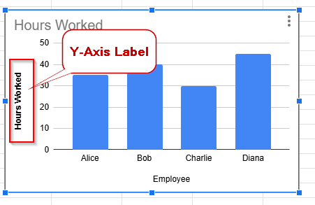
➤ You can see the Y-axis label is added like “Hours Worked”
Fix Google Sheets Horizontal Axis Labels not Showing
Horizontal axis means x-axis. If your horizontal axis label is not displaying in Google Sheets, there may be an issue with your chart. Let’s find out the problems first and solve them step by step.
Removal of the X-Axis
If you can see that in the chart settings options, the x-axis title is blank. Then you can’t see the horizontal axis label in the chart. Even though the data range is correctly selected in the chart but you can’t see the horizontal axis label.
 ➤ Click on the chart to select it, click the three dots and then click the Edit chart option.
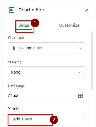
➤ In the chart editor setup option, you can see that the x-axis is blank. Click to add the x-axis.
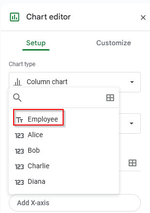
➤ Choose the “Employee” option to add the X-axis.
➤ Now you can see the horizontal axis label is showing in the chart.
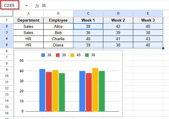
Unsupported Horizontal Axis Label
A pie or scatter plot chart doesn’t use a horizontal axis label. So you can’t see the horizontal axis label in that chart.
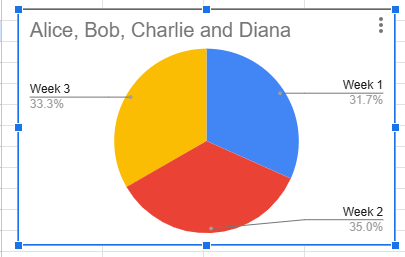
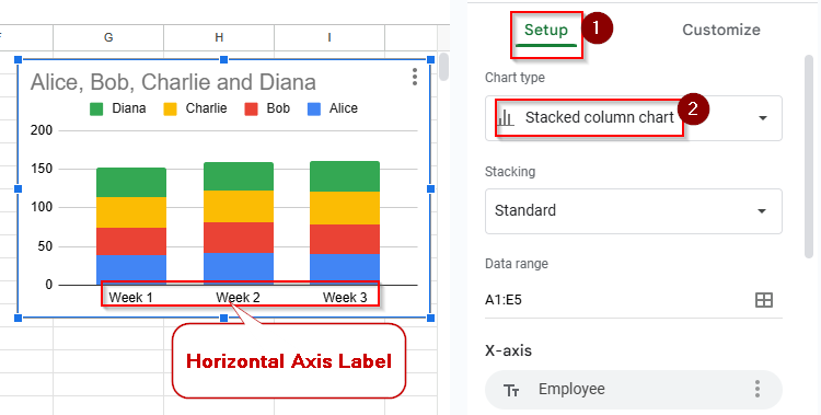
To fix this problem, you need to change the chart type to a column chart/ bar chart/ line chart. Click the setup tab and choose a stacked column chart.
Unclear Horizontal Axis Label
In your chart, your horizontal axis label font size is not readable to anyone. So you need to fix this issue.
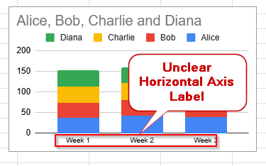
➤ You can customize your horizontal axis label in the customize tab. Select the horizontal axis and increase the font size to see the horizontal axis label. You can make it Bold to make it clear.
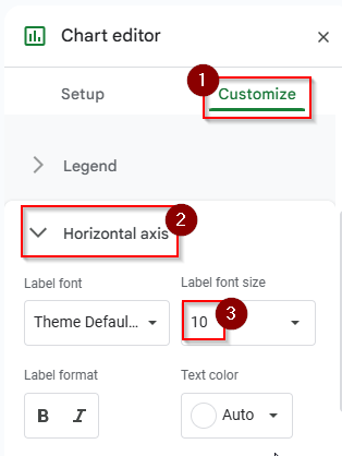
➤ Now you can see that the horizontal axis is visible.
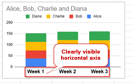
Incorrect Data Range
If your data range is selected incorrectly, then you can’t see the horizontal axis label in the chart.
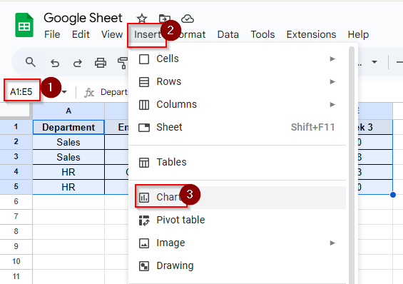
➤ To solve this issue, you need to verify the data range. You have to select the data range properly and then click the Insert > Chart option
➤ Now you can see that the issue is solved. The chart is showing the correct data range and horizontal axis label.
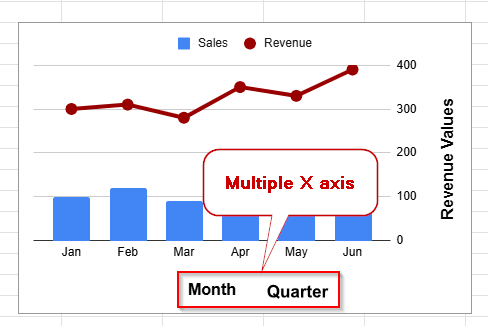
Multiple X Axis in Google Sheets
Unfortunately, you can’t add multiple X-axes (horizontal axes) directly in Google Sheets like Excel. However, you can use the drawing option to simulate multiple X-axes in a chart in Google Sheets visually. Follow these step by steps to add multiple x-axes in Google Sheets.
➤ Click on the chart to select it, click the three dots and then click the Edit chart option.
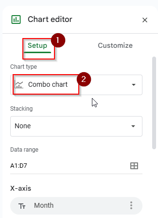
 ➤ Click on the setup tab and choose the combo chart option.
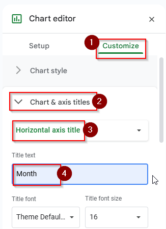
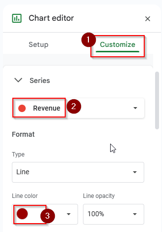
➤ Click on the customize tab and choose chart & axis titles > horizontal axis title, type the title of the text “Month”.
➤ In the customize tab, choose the revenue option in the series and choose the line color.
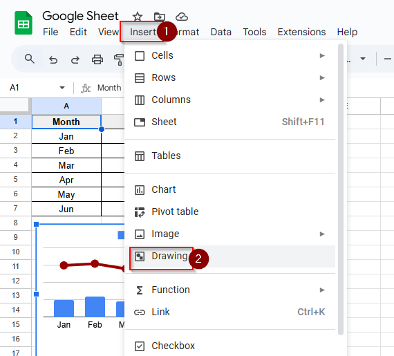
➤ To draw and visually add another axis, go to Insert > Drawing
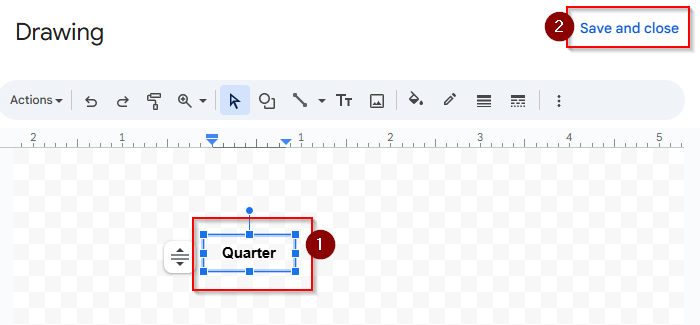
➤ Type “Quarter “ then click save and close.
➤ Place the text in the chart and look at the chart that has multiple x axes.
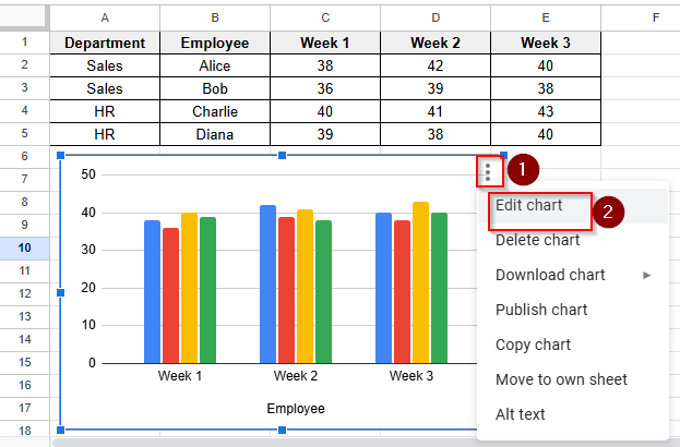
Label a Legend in Google Sheets
In a chart, a legend is a guide that explains the meaning of each color, shape, or pattern in a chart in Google Sheets. The legend helps to differentiate the complex data if your chart contains multiple data series. To update or label a legend in Google Sheets, follow these steps:
➤ Click on the chart to select it, click the three dots and then click the Edit chart option.
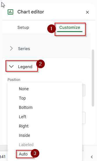
➤ Click on the Customize > Legend option. Choose Auto. The legend will adjust automatically.
➤ Now you can see the legend is labelled with color.
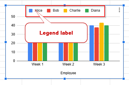
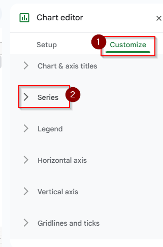
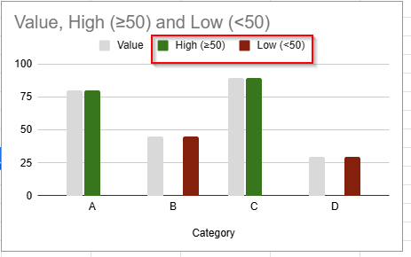
Chart Color Based on Value in Google Sheets
You can’t do conditional coloring (like red if value < 50) directly in charts. But you can get this effect by using helper columns, series splitting, and custom colors in a chart. Suppose you want to see Bars ≥ 50 to be green and Bars < 50 to be red. Follow these steps below to make a chart where bar or column colors change based on the value.
➤ Click on the chart to select it, click the three dots and then click the Edit chart option.
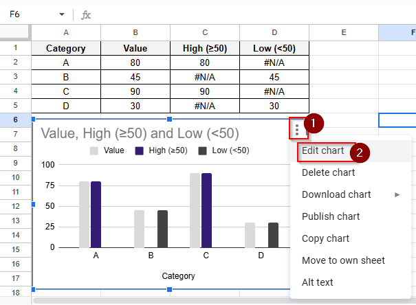
➤ Click on the Customize Tab and then click the series option.
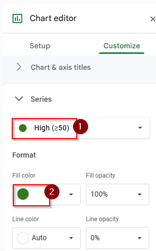
➤ Select High>50 and choose green color.
➤ Select Low<50 and choose red color.
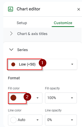
➤ Now you can see the colors have changed to green and red.
Add Error Bars in Google Sheets
Error bars help show the possible variation or uncertainty in your chart data. They’re often used in scientific or statistical charts to represent intervals or margins of error. You can add error bars to column, line, and scatter charts.
➤ Click on the chart to select it, click the three dots and then click the Edit chart option.
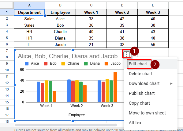
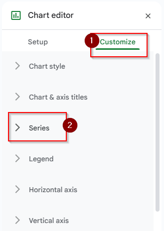
➤ Click on the Customize Tab and then click the series option.
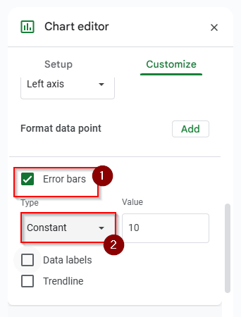
➤ Check the box that says “Error Bars” You can also customize your Error Bars with error bar type and value.
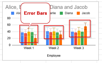
➤ Now you can see the constant type error bars in your chart.
Frequently Asked Questions
How can I make my chart have gridlines?
Go to Customize > Gridlines and Ticks option. You can choose major and minor gridlines, and the tick marks on both axes can be changed.
Can I change the background color of the chart?
Of course. Select a background color for the chart area by selecting Customize > Chart style.
Can the labels on the X-axis be rotated?
Yes. To alter the x-axis label to be rotated, select Customize > Horizontal axis and change the slant label degree.
Concluding Words
You can make your data visually appealing in Google Sheets by formatting your charts. Chart formatting in Google Sheets helps to understand the data clearly. Chart formatting is very easy in Google Sheets. With a few clicks, you can change chart Titles, colors, labels, axes, and more according to your choice. With a formatted chart, you can create a report, a presentation, or just organize your data. We have described clearly and step by step how you can format your chart. If you have any questions or get stuck at any point, please feel free to share them in the comment section.