Sometimes it’s difficult to understand the data by looking at charts or graphs. Using a trendline, your data will be more meaningful and easier to explain. You can use a trendline in your Google Sheets chart, whether sales are increasing, website traffic is decreasing, or nothing is changing. Adding a trendline is very simple, and you can use trendlines in line charts, scatter plots, and column charts. In this article, we will describe in detail how to add a trendline, as well as how to find the equation and slope of a trendline in Google Sheets.
What is a Trendline in Google Sheets?
A trendline is a line that you can add to a Google Sheets chart to indicate the general direction or pattern of your data. When your sales are rising, the trendline will rise. If your data is dropping, the trendline will go down. Using a trendline, you can determine whether your data is increasing, decreasing, or remaining the same. Without looking at every data point in detail, you can understand the data quickly. You can use a trendline to:

- See patterns across time.
- Create visually compelling reports or presentations.
- Forecast future values based on past data.
How to Add a Trendline in Google Sheets
You can understand the direction of your data by adding a trendline to your Google Sheets chart. To quickly understand whether sales, website traffic, or any other type of progress is increasing, decreasing, or remaining constant over time, you can add a trendline. With a few clicks, you can add a trendline in Google Sheets. Let’s look at the dataset below, where you can add a trendline to your chart. Follow these instructions step by step to add a trendline to your chart.
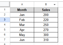
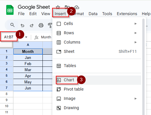
➤ Select the cells A1:B7 and click Insert > Chart
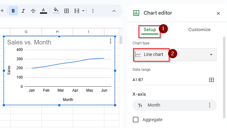
➤ In the chart editor panel, click the setup tab and choose Line chart
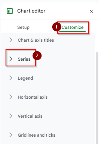
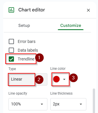
➤ Click Customize > Series option.
➤ Put a tick mark on the Trendline option, choose the trendline type “ Linear” and choose trendline color “red”. You can customize the trendline according to your preference.
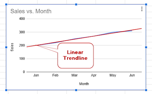
➤ Now you can see that the trendline is added in the line chart.
How to Find the Equation of a Trendline in Google Sheets
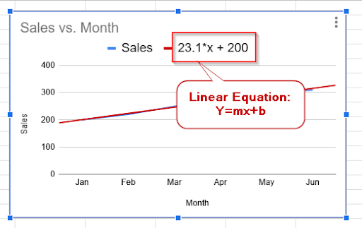
When you’ve added a trendline to your chart in Google Sheets, you can see its equation. From that equation, you can understand the rate of change in your data. The equation of a trendline usually looks like this:
y = mx + b
Here, m is the slope (it shows how much y changes as x increases), and b is the y-intercept (the value of y when x is 0)
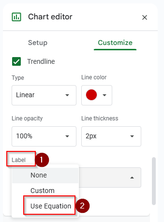
➤ Click on the Label option and choose “Use Equation” to see the equation of this trendline.
➤ Now you can see the equation is 23.1x + 200 which is linear equation.
How to Find the Slope of a Trendline in Google Sheets
The slope of a trendline is very important to understand the data in your chart. When you’re tracking progress, examining patterns, or evaluating sales over time, finding slope can help you determine the relationship of your data. You can find the slope by adding a trendline to a chart or using formulas. Let’s look at the dataset below, where you can find the slope of a trendline by using the chart tools.
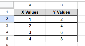
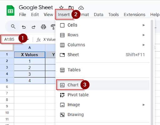
➤ Select the cells A1:B5 and click Insert > Chart
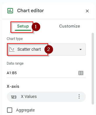
➤ In the chart editor panel, click the Setup tab and choose the chart type “ Scatter Chart”
➤ Click Customize > Series
➤ Put a tick mark in the trendline option and choose the label “ Use Equation”
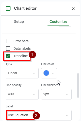
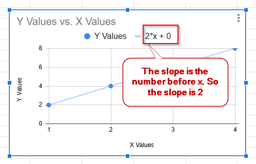
➤ Now you can see an equation on the chart like y = 2x + 0. The number before x is the slope of the trendline. So, here the slope is 2
Frequently Asked Questions
Which charts support trendlines in Google Sheets?
In Google Sheets, trendlines can be included in line, scatter, and column charts.
How can I add multiple trendlines?
You can add multiple trendlines for each series under the Series selection if your chart has two product lines.
Why can’t I include a trendline in my chart?
If you’re using a pie chart or a stacked bar chart, you can’t include a trendline in your chart. Only Line, scatter, and column charts support trendlines.
Concluding Words
You can understand your data quickly by using the trendlines. Adding a trendline is very easy. With only a few clicks, you can add a trendline to the chart. When you’re tracking growth, evaluating performance, or identifying trends over time, you can get a clear idea about the data by using trendlines. You can find the explanation of your data from the trendline equation. By adjusting the style and type of the trendline, you can know details information about the data. Feel free to ask any questions in the comment section if you don’t understand anything or get stuck in any step.