Comparison charts in Excel are excellent tools for spotting patterns, differences, and trends across categories or time periods. Whether you’re comparing quarterly revenues, product ratings, or survey results, the right visual can make your data easier to understand and act on. Instead of scanning through raw numbers, you can instantly highlight strengths, weaknesses, and gaps which make your reports more effective and decision-making faster.
In this article, we’ll learn several different ways to build comparison charts in Excel starting from clustered column charts to versatile combo charts. Each method serves a different purpose depending on your data type and comparison goal. Let’s get started.
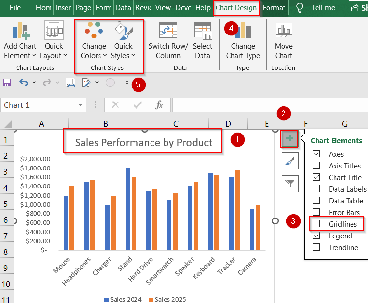
Steps to make a comparison chart in excel:
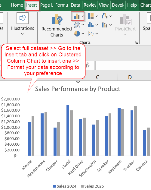
➤ Select your full dataset (A1:C11).
➤ Go to the Insert tab >> Choose Insert Column or Bar Chart >> Select Clustered Column.
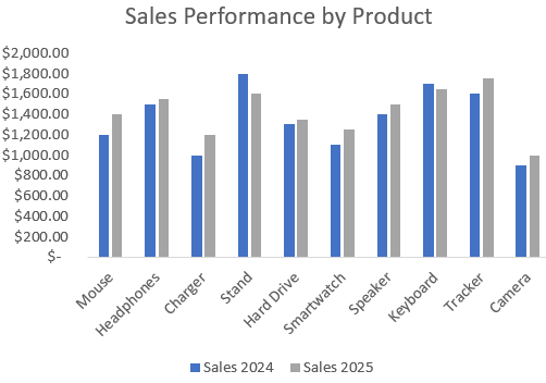
➤ Excel will insert the chart comparing Sales 2024 and Sales 2025 side by side for each product.
➤ Add a clear chart title, and apply color or style formatting from the Chart Design tab as needed. Remove Gridlines from Chart Elements to reduce clutter.
Compare Multiple Categories Side-by-Side with a Clustered Column Chart
When you’re comparing two or more numerical values for the same category like sales from different years, a clustered column chart gives a quick, side-by-side visual. It’s ideal for situations where the categories (e.g., products) remain constant, and you want to see how their values change over time or across conditions.
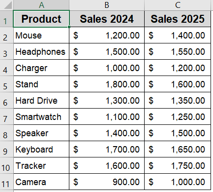
To demonstrate the comparison chart methods, we’ll use a simple dataset showing sales figures for 10 products from 2024 and 2025. This lets us easily visualize year-over-year performance and spot growth trends.
Steps:
➤ Select your full dataset (A1:C11).
➤ Go to the Insert tab >> Choose Insert Column or Bar Chart >> Select Clustered Column.
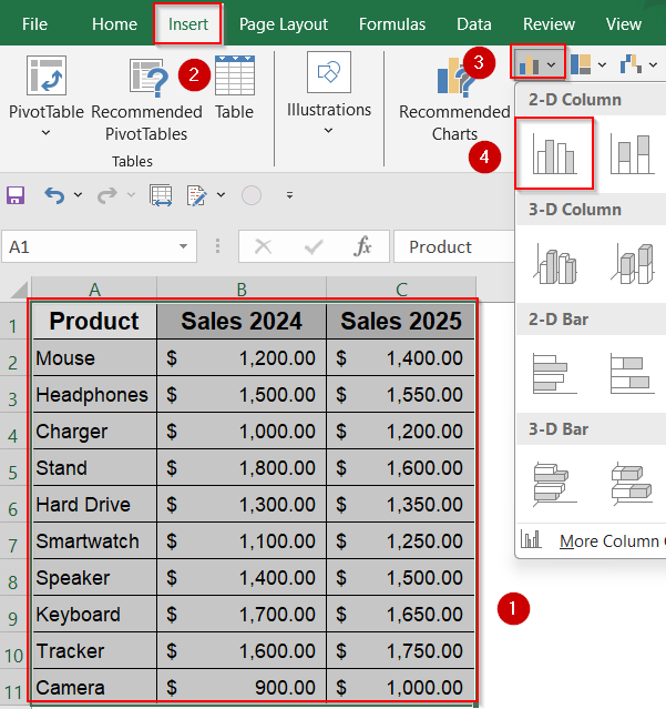
➤ Excel will insert the chart comparing Sales 2024 and Sales 2025 side by side for each product.
➤ Add a clear chart title, and apply color or style formatting from the Chart Design tab as needed. Remove Gridlines from Chart Elements to reduce clutter.
Now you have your customized comparison chart.
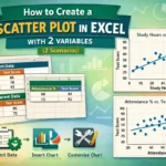
Plot a Scatter Chart to Create a Comparison Chart
Scatter charts are great for detecting patterns and trends between two continuous variables which is especially helpful when you’re comparing performance, growth, or deviation across datasets. Use this when you want to see how closely the values from two different series (like two years’ sales) correlate.
Steps:
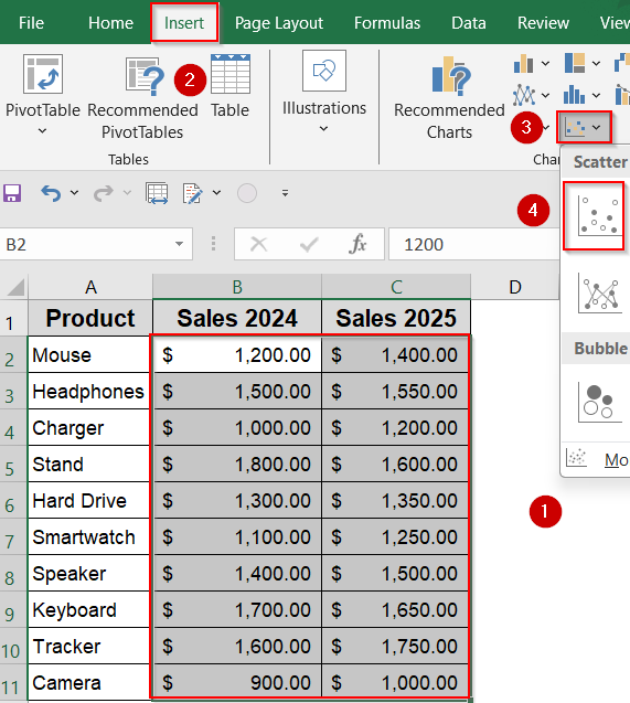
➤ In a blank area, set up your X and Y series such as Sales 2024 and Sales 2025 in column A and B respectively.
➤ Select the two columns of data (B2:C11) excluding headers.
➤ Go to Insert >> Click Scatter >> Choose Scatter with only Markers.
➤ Use Chart Elements (plus sign) to add or remove gridlines, labels, or a trendline if desired.
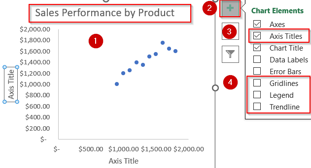
➤ Add axis titles like “Sales 2024” (X-axis) and “Sales 2025” (Y-axis).
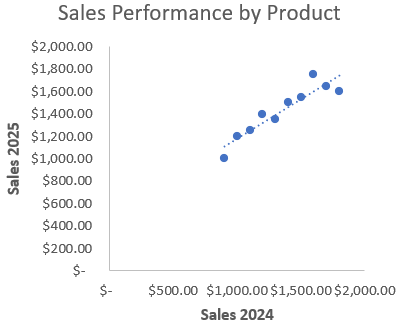
Now we have our customized scatter plot for comparison.
Combine Visual Styles with a Custom Combo Chart
Combo charts are powerful tools when comparing variables that benefit from different visual representations. For example, using columns for one year and a line for another helps you emphasize performance trends while still showing actual values. This is especially useful when one value needs to stand out clearly.
Steps:
➤ Select your dataset (A1:C11).
➤ Go to Insert tab >> Choose Combo Chart >> Select Clustered Column- Line on Secondary Axis or whichever you like.
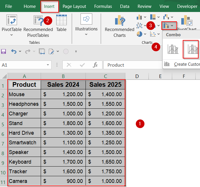
➤ Excel will display a combination chart showing column values alongside a line which is great for highlighting differences.
➤ Format as needed using Chart Design tools and Chart Elements.

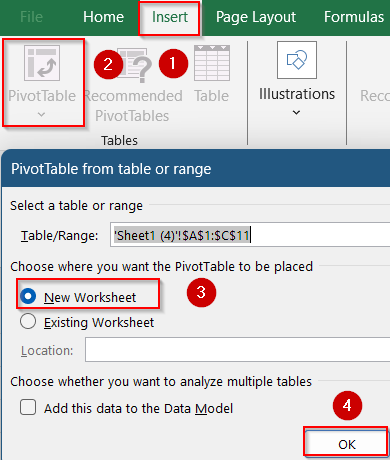
Summarize and Compare with a Pivot Table and Line Chart
When your dataset is large or categorized by multiple dimensions (like months, regions, or departments), a Pivot Table gives you control over summarizing values. Pairing it with a line chart lets you track trends and patterns in the summarized data which is perfect for high-level comparisons.
Steps:
➤ Select your dataset and go to Insert tab >> Click PivotTable >> Insert it into a new worksheet.
➤ Drag Product into the Rows area.
➤ Drag both Sales 2023 and Sales 2024 into the Values area.
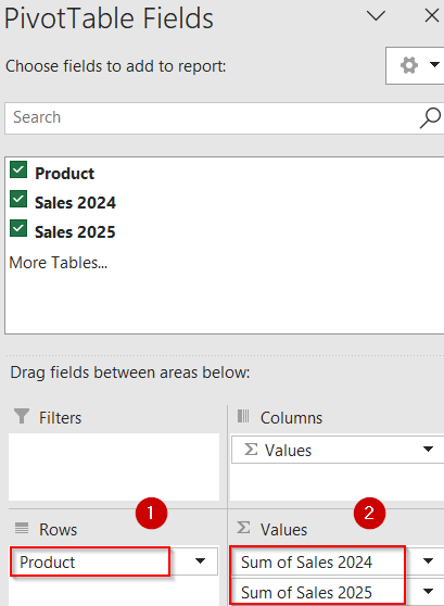
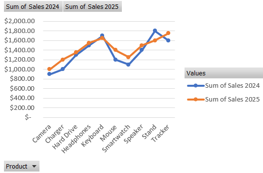
➤ Click inside the PivotTable and go to Insert >> Choose Line Chart >> Pick Line with Markers.
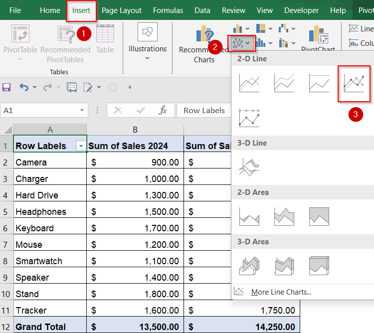
➤ The line chart will automatically reflect totals from the PivotTable for easy comparison.
Frequently Asked Questions
What is the best chart for comparing two data sets in Excel?
A combo chart or clustered column chart is usually best when comparing two metrics side by side. If your goal is to spot trends or relationships, line charts and scatter plots may be more effective.
Can I compare more than two data sets in one Excel chart?
Yes, Excel allows you to include multiple series in a single chart. Using combo charts, multiple axes, or line graphs, you can easily visualize 3+ datasets. You only need to ensure clear labeling and color distinction.
Why are my comparison bars overlapping in a column chart?
This often happens when using a stacked column chart instead of a clustered one. Switch to clustered columns to display each value side by side for better visual separation and clearer comparison.
How do I make comparison charts dynamic?
Use features like Excel Tables, named ranges, or slicers to make your charts dynamic. These tools automatically reflect changes in the dataset, keeping your chart up to date without manual edits.
Wrapping Up
In this tutorial, we’ve learned four practical ways to create a comparison chart in Excel starting from basic clustered column setups to more advanced combo and Pivot-based line charts. Whether you’re analyzing performance, visualizing trends, or highlighting gaps, Excel gives you the flexibility to build meaningful, presentation-ready visuals. Feel free to download the practice file and share your feedback.