People often use google sheets for logging activities and project management. For these jobs, it is not uncommon to have a date and time on a sheet. Sometimes, for deadlines and such, the time ...
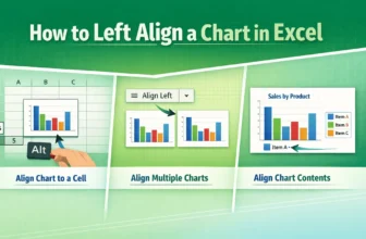
Left alignment is the alignment of an object on the left of some reference. “Left-align” in an Excel chart may indicate aligning a chart to a cell, aligning multiple charts, or aligning the elements ...
The logarithmic scale is the representation of multiplicative changes rather than additive changes. In other words, each step is a multiplication of the previous number on a logarithmic scale. It is ...
The axis scale is the range of values displayed along an axis. To change the axis scale in Excel, we need to access its maximum and minimum bounds.An axis has a minimum (lower bound) and maximum ...
The trend percentage is an ambiguous term often used to describe the change of a value relative to a base term. To calculate the trend percentage in Excel, we need to use the mathematical formula.
...
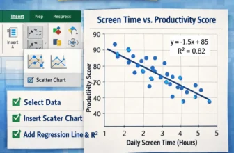
A correlation graph, also known as a scatter plot, is a great way to visualize the relationship between two variables. A correlation graph can be made quickly with Excel’s charting feature, and this ...
Trend analysis is the method of identifying patterns or data shifts over time. To calculate trend analysis, Excel provides different features and functions.In trend analysis, the main goal is to ...
The slope is a measurement of steepness and direction. It can be the steepness of a line or the steepness of the tangent (for a point in a curve). Finding the slope of a trendline in Excel is useful ...
When working on a spreadsheet, we often need to analyze our data in numerous ways. Sometimes, we might want to check every other row to find a pattern or sort some data. Removing every other row for ...