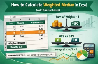
Not every observation has an equal weight when analyzing real world data. Assignments and tests frequently have varied weights, in finance, some transactions may account for higher volumes, and in ...
When planning or analyzing data in Excel, it's crucial to understand how changes in your inputs can affect the outcome. Excel offers powerful what-if analysis tools like Scenario Manager, Goal Seek, ...
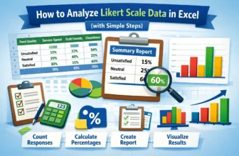
Analyzing Likert scale data is an essential part for understanding customer feedback. It allows businesses and researchers to measure the sentiment behind responses, providing a clearer picture of ...
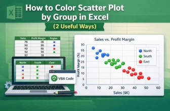
Scatter plots in Excel are useful for visualizing relationships between variables. Coloring the scatter plot based on groups, such as regions or categories, highlights patterns or trends. Let’s say ...
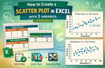
Scatter plots effectively visualize the relationship between two variables, vital for data analysis in business, science, and education. Microsoft Excel provides an easy way to create a scatter plot ...
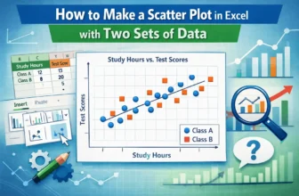
A scatter plot in Excel is a powerful tool for identifying relationships between variables, analyzing data patterns, detecting outliers, conducting trend analysis, and comparing data sets. Whether ...
Combining formulas in Excel allows you to find insightful summaries, which is useful for data analysis. This article covers five easy ways to combine two formulas in Excel with proper explanation and ...
If you need to swap two rows in Google Sheets but don’t want to mess up your data or formatting, Google Sheets makes it easier. This article will show you different ways to swap rows, with or without ...
If you need to fix wrapped text, align images better, or improve the overall layout of your spreadsheet, Google Sheets makes it easier. This article will walk you through a few simple methods to ...