Pie charts are ideal for showing how individual categories contribute to a total, especially when visualizing survey results, spending breakdowns, or market share. But just showing percentages or just showing raw values can often be limiting. For a more complete view, Excel allows you to show both the actual values and the percentage share of each slice on your pie chart.
In this article, you’ll learn how to display both percentages and numeric values together in an Excel pie chart. We’ll walk through the step-by-step process using a sample dataset, show how to format and reposition labels for clarity, and answer the most common questions users have about labeling pie charts in Excel.
Steps to show both percentage and value in an Excel pie chart:
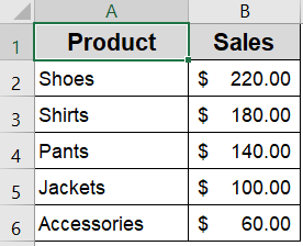
➤ Select a dataset that includes categories and their numerical values (e.g., product names and sales figures).
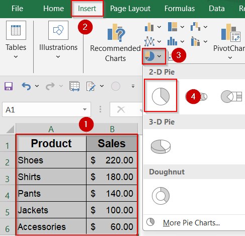
➤ Insert a pie chart from the Insert tab to create a visual breakdown of the data.
➤ Right-click any slice >> Choose “Add Data Labels” >> Click “Format Data Labels” to enable both Value and Percentage.
➤ Tweak label positioning, number formatting, and font styling for improved legibility and design consistency.
Steps to Show Both Percentage and Value in Excel Pie Chart
Adding both percentage and value labels makes your chart more informative and allows viewers to grasp absolute numbers and proportions at once. Let’s walk through it using a small dataset of product sales. We’ll use this dataset to create a pie chart that displays both the value and the percentage for each product category.
Step 1: Insert the Pie Chart
The first step in creating an insightful pie chart is to insert the chart itself using your data. Pie charts are great for showing how different categories contribute to a whole, like sales by product or budget distribution. Excel offers simple tools to quickly generate these charts once you select the right data range. Starting with a basic pie chart gives you a foundation to customize and enhance the visual details.
Steps:
➤ Select the range A1:B6 containing the category names and sales values.
➤ Go to the Insert tab in the ribbon.
➤ Click the Pie Chart icon in the Charts group.
➤ Choose the first 2-D Pie option from the dropdown.
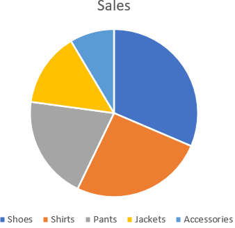
Excel will instantly create a pie chart with default labels, which may only show values or none at all.
Step 2: Add Data Labels to the Chart
Once your pie chart is visible, the next important step is to add data labels. Labels communicate exactly what each slice represents, making the chart easier to understand at a glance. By default, Excel might not show these labels or only show raw values, so you’ll want to add and customize them for clarity and context.
Steps:
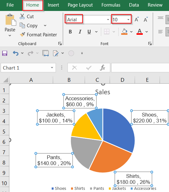
➤ Click once on any slice of the pie to select the full chart.
➤ Right-click on any slice >> Choose Add Data Labels.
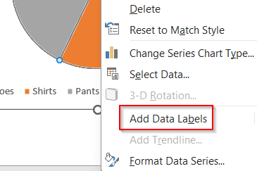
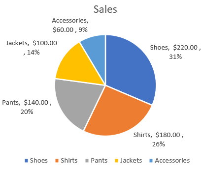
➤ The values will now appear by default on each slice.
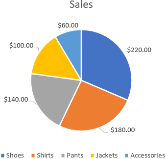
These are just the raw values, we’ll add percentages next.
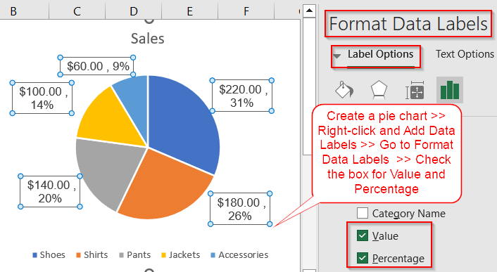
Step 3: Enable Both Percentage and Value in Labels
To provide more comprehensive information, you can configure data labels to show both the actual values and their percentage of the total. This dual display helps your audience quickly grasp both the quantity and proportion of each slice. Excel’s Format Data Labels pane gives you fine control over what information is shown, including optional category names.
Steps:
➤ Right-click on any label >> Select Format Data Labels.
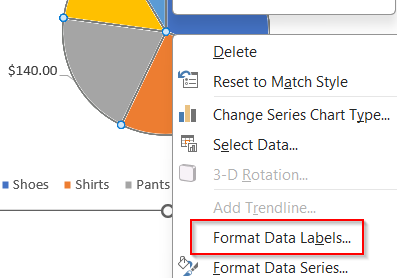
➤ A panel will appear on the right side.
➤ Under Label Options, check both Value and Percentage.
➤ Also check Category Name if you want to include the product names too.
➤ Optionally, uncheck Show Leader Lines if labels look crowded.
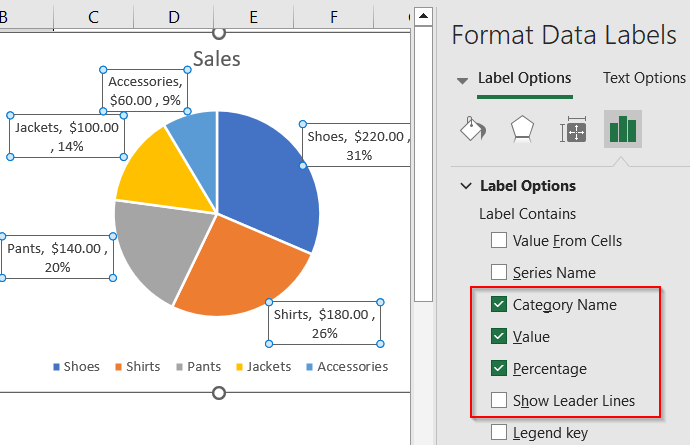
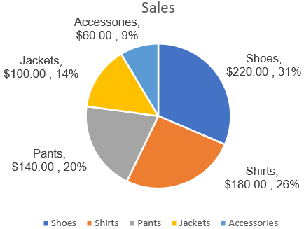
Excel will now display both values and percentages on each pie slice either inline or stacked based on space.
Step 4: Format Label Appearance for Better Readability
Labels can easily become cluttered or hard to read if left with default settings. To improve clarity and professionalism, you should adjust the font size, number formatting, and label positioning. Making these changes enhances the overall look and helps ensure your chart communicates data in a clean and effective manner.
Steps:
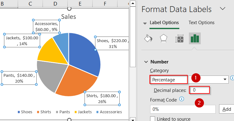
➤ In the Format Data Labels pane, scroll down to Number.
➤ Choose Percentage >> Set Decimal Places to 1 or 0, based on your preference.
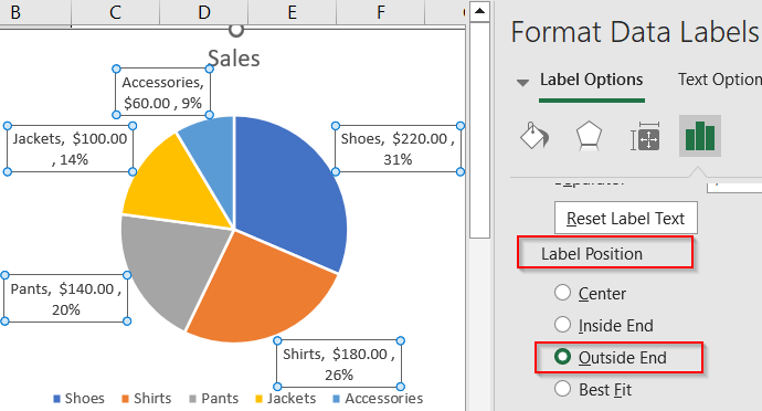
➤ Click Label Position >> Choose Outside End for clearer spacing.
➤ Change font size or style by selecting labels and using the Home tab.
➤ You can also manually drag the boxes to set their position.
Formatting labels helps your pie chart appear cleaner and more professional.
Frequently Asked Questions
How do I show both percentage and value in a pie chart?
To display both percentage and value on pie chart slices, right-click the data labels and select Format Data Labels. Then, under Label Options, check both Value and Percentage boxes. Excel will automatically show both on each slice for clearer data representation.
Can I include the category names too?
Yes. In the Format Data Labels pane, just check the box for Category Name. You can show the name, value, and percentage all together, although it may require adjusting layout or label position.
Why are my percentages not accurate?
Percentages in pie charts are calculated based on the total of all visible values. If you’ve filtered data or included blanks, percentages may appear skewed. Double-check your dataset for accuracy.
Can I format the value and percentage labels separately?
Excel treats the combined value and percentage as a single label, so you cannot format them individually. But you can customize the overall font size, color, and number format in the Format Data Labels pane to enhance readability for both elements simultaneously.
What if labels are overlapping or cut off?
If labels overlap or are cut off, try changing the label position to Outside End or Best Fit in the format options. You can also manually drag individual labels around the chart to reposition them and improve clarity.
Wrapping Up
In this tutorial, we explored how to display both percentage and value in an Excel pie chart, offering a complete picture of your data. By combining these two label types, you help viewers understand not just what proportion each slice represents, but also how that translates into real-world figures. Whether you’re analyzing sales distribution or survey results, this technique improves clarity and adds depth to your visualizations. Feel free to download the practice file and share your feedback.