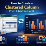
Charts are extremely useful for statistical analysis. In Excel, charts are often used in conjunction with tables to visualize data. In a pivot table, charts become even more useful as they provide a good solution to organize all the visual representations of data in one place. In this article, we will learn how to create a chart from a pivot table in Excel with some easy steps.
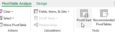
➤ Select a cell of the pivot table so that the PivotTable Analyze tab shows up.
➤ Go to that tab and click on PivotChart.
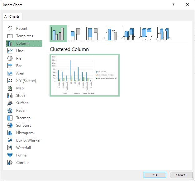
➤ Select your preferred type of chart and hit OK.
Charts are handy for many reasons, and in this article, we will show you all the ways you can make a chart from your pivot table. So open Microsoft Excel, and follow along to get your practice done.
What is a Pivot Chart in Excel?
A pivot chart is a dynamic visualization of the data presented in a pivot table, making it easier to demonstrate the spreadsheet to others. The chart is created directly from the pivot table. As the pivot table is updated, the chart also changes accordingly. A pivot chart is different from a regular chart, as regular charts do not allow as much flexibility as a pivot chart does.
Adding a Pivot Chart Manually
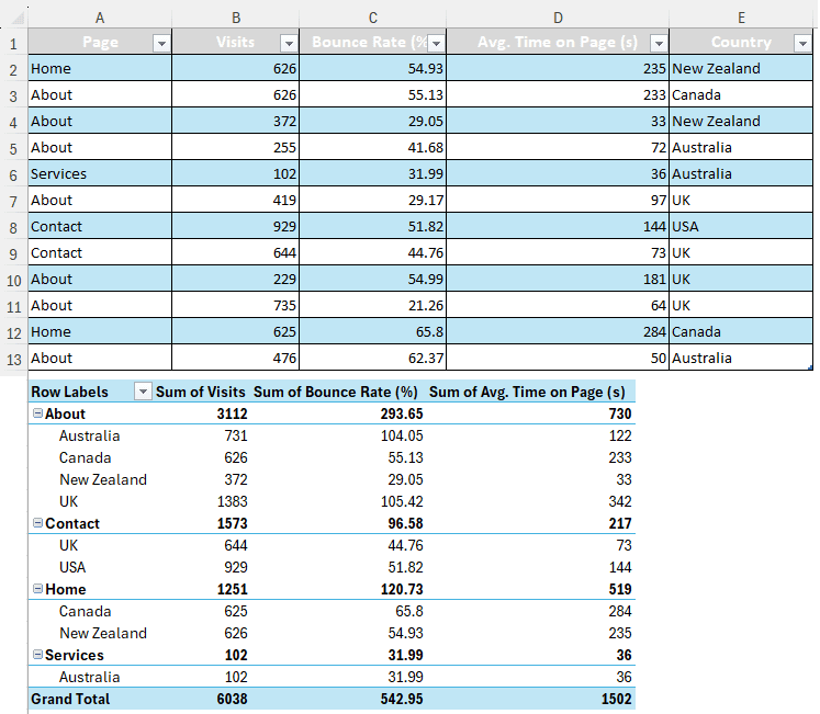
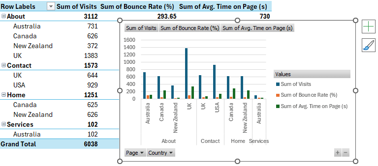
For this tutorial, we have some data about website traffic in our dataset. We have created a pivot table to quickly summarize the visits, bounce rates, and average time spent on pages by individuals from various countries in the world. In order to simplify the data further, we are going to make a chart of it.
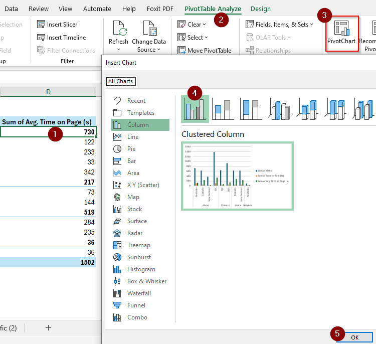
➤ Select a cell of the pivot table so that the PivotTable Analyze tab gets enabled.
➤ From that tab, go to Tools > PivotChart.
➤ From the Insert Chart window, we can select different types of charts that we can create from the pivot table. The default chart type is column, and the default chart is Clustered Column. You can select almost any chart type from this window, but we are going to keep the default one and press OK.
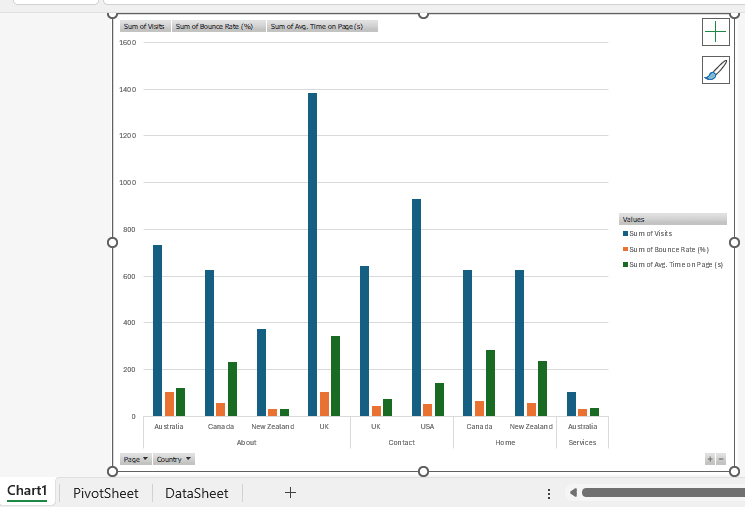
➤ Now, a chart will be added to your pivot table.
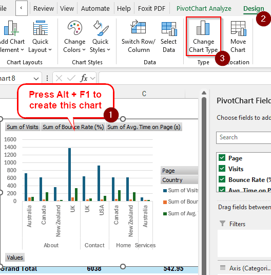
Adding a Pivot Chart with Keyboard Shortcut
➤ Select a cell from the pivot table like you did in the previous method.
➤ Press Alt + F1 to create a pivot chart directly. This will create a chart with the default settings, which results in a clustered column chart.
Note:
If you want to change the chart type, you can do it by selecting the chart first and going to the Design tab. There, you can click on Change Chart Type and select your desired type of chart from the window that is identical to the Insert Chart window of the previous method.
➤ To create a chart in another sheet, press F11 while having a cell of the pivot table selected.
Frequently Asked Questions
How to make a regular chart from a PivotTable?
Microsoft Excel automatically creates a pivot chart from a pivot table. In order to make a regular chart from a pivot table, you need to copy the data from the pivot table to another data range and create a chart from that range. Then, you can change the chart range so that it uses the pivot table instead of the regular table.
How to create a map chart from a PivotTable?
You cannot create a map chart from a pivot table. You need to copy the data from the pivot table to a regular table or use the source table to create a map chart.
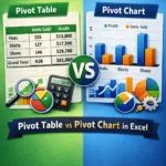
What is the difference between a pivot table and a pivot chart?
A pivot chart is more like a regular chart that works with a pivot table. A pivot table is a table that can be dynamically changed whenever required, and the rows and columns can be sorted and switched back according to the user’s needs.
How do you create a chart from a table in Excel?
Select the table in Excel from which you want to make a chart. Then go to the Insert tab and select the desired chart format from the Charts section.
How do you collapse a pivot chart?
In the pivot chart, look for the minus (–) sign on the bottom right. Click on that to collapse the fields, and click on the plus (+) sign to expand them.
Wrapping Up
In this article, we learned how to create chart from pivot table in various ways. Hope that the tutorial was helpful for you. If you want more tutorials like this, bookmark the site and come back regularly to learn something new every day. Leave your suggestions below and download the workbook we used in this tutorial for your own practice.