Outliers are data points that significantly differ from the rest of your dataset, either much higher or lower than expected. These extreme values can disrupt your analysis by inflating averages, distorting trends, or misrepresenting relationships in charts. Whether you’re analyzing product sales, experimental measurements, financial forecasts, or survey responses, it’s essential to identify and handle outliers to ensure your insights remain reliable and unbiased.
In this article, we’ll explore three effective ways to detect and remove outliers in Excel. We’ll walk through formula-based methods, visual techniques using charts, and hands-on filtering approaches focused on helping you clean your data and improve overall accuracy.
Steps to remove outliers in Excel:
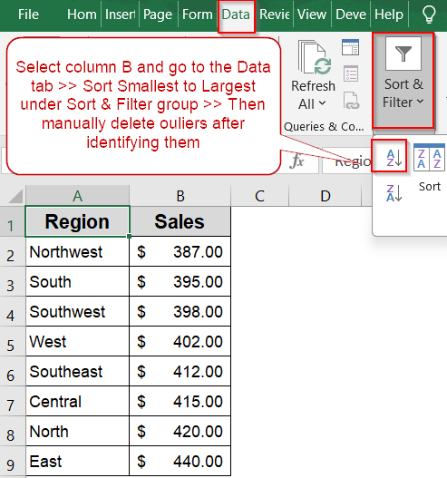
➤ Select the dataset range you want to clean, for example, cells B2:B11.
➤ Go to the Home tab, click Sort & Filter in the Editing group, and choose Sort Smallest to Largest.
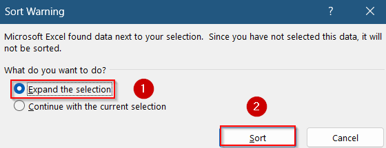
➤ In the dialog box, select Expand the selection and click the Sort button.
➤ The data will now be ordered from the lowest to highest values, making it easier to spot extreme numbers.
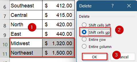
➤ Select rows using Ctrl and right-click to manually Delete the top and/or bottom values that clearly fall outside the expected range. Choose Shift cells up and hit OK when prompted.
Exclude Outliers Manually Using Sort & Filter Feature
If your dataset contains a few values that are far outside the normal range, those outliers can distort analysis or visuals. By using Excel’s built-in Sort & Filter tools, you can quickly organize your data in ascending or descending order, making it easier to spot unusually high or low numbers. Once identified, these outliers can be manually deleted or hidden depending on your analysis goals.
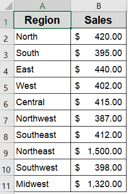
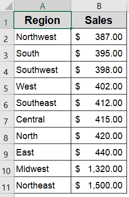
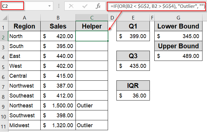
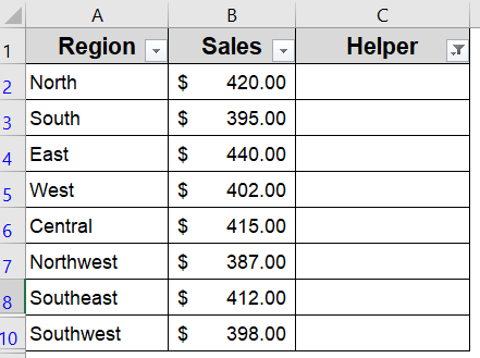
We’ll use a sample dataset that shows regional sales figures across 10 areas. Most values cluster around the $390–$440 range, but two regions called Northeast and Midwest report unusually high sales, indicating possible outliers that may distort visual trends in analysis.
Steps:
➤ Select the dataset range you want to clean, for example, cells B2:B11.
➤ Go to the Home tab, click Sort & Filter in the Editing group, and choose Sort Smallest to Largest.
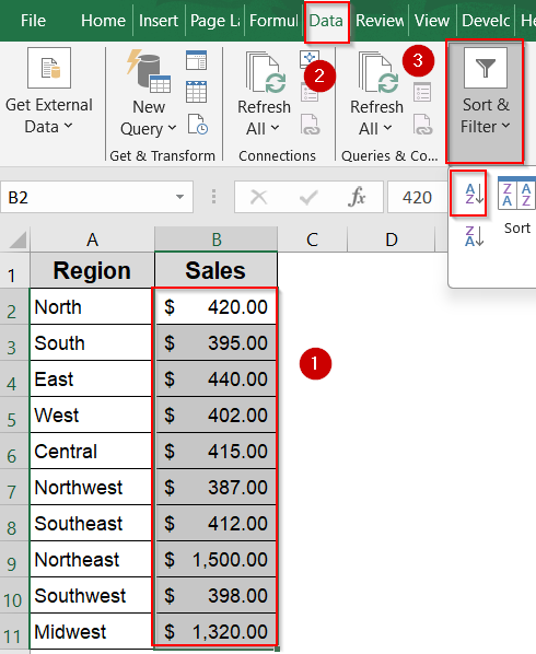
➤ In the dialog box, select Expand the selection and click the Sort button.
➤ The data will now be ordered from the lowest to highest values, making it easier to spot extreme numbers.
➤ Select rows using Ctrl and right-click to manually Delete the top and/or bottom values that clearly fall outside the expected range. Choose Shift cells up and hit OK when prompted.
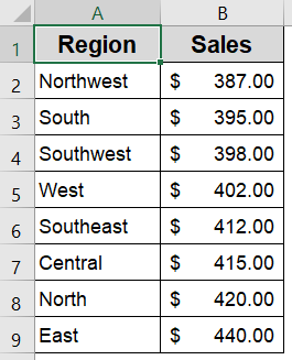
Your dataset is now trimmed of visible outliers, which can help improve the clarity of charts and summary statistics.
Use TRIMMEAN Function to Calculate a Smoothed Average Excluding Outliers
When your dataset includes extreme high or low values, they can significantly distort the overall average. Instead of manually removing these outliers or using complex statistical methods, the TRIMMEAN function in Excel offers a cleaner, more reliable solution. It calculates a “trimmed” mean by excluding a specified percentage of the highest and lowest values by providing a more accurate picture of central tendency.
Steps:
➤ Click on a blank cell where you want to display the average.
➤ Enter the formula in D2 cell:
=TRIMMEAN(B2:B11, 0.2)
This formula skips the lowest (387) and highest (1500) values and returns the average of the remaining numbers.
➤ Press Enter for output.
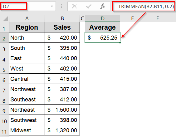
Now Excel will automatically exclude 20% of values (10% from each end) before calculating the average.
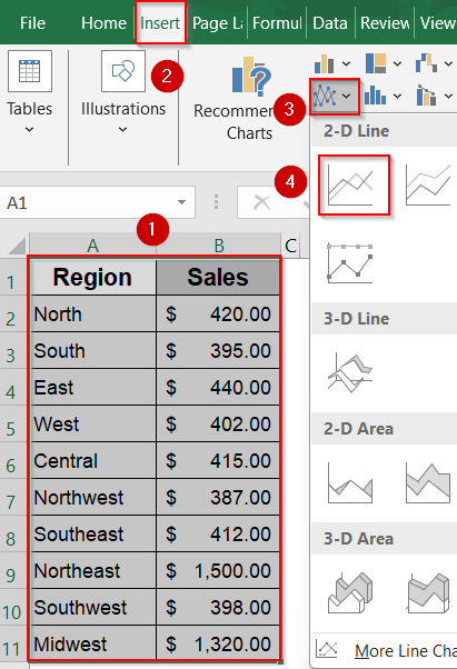
Remove Outliers to Clean Up Line Chart Visuals
If your line chart appears compressed or skewed, it’s often due to a few extreme values stretching the Y-axis scale. This method is effective when your goal is to make trends easier to interpret by removing those disruptive outliers directly from the dataset. Just be aware that this approach permanently alters your data, so use it when visual clarity takes priority over completeness.
Steps:
➤ Select the range A1:B11 and insert a Line Chart from the Insert tab.
➤ Observe how the chart flattens due to unusually high or low values pulling the line extremes.
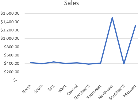
➤ Identify and delete the rows for “Northeast” and “Midwest”, which contain the most extreme values.
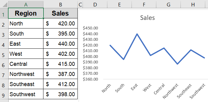
The line chart will automatically refresh, now showing a more balanced and visually meaningful trend.
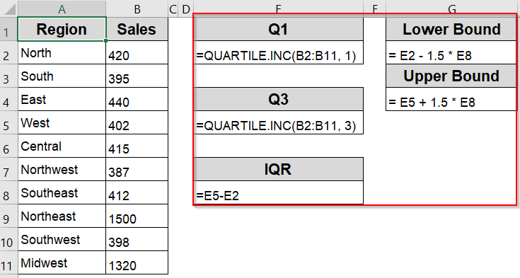
Manually Detect and Remove Outliers Using IQR Logic
When you need full control over which values are considered outliers, the Interquartile Range (IQR) method is a statistically sound approach. This technique identifies values that fall far outside the typical range of your dataset, so you can flag or exclude them manually. It’s especially useful when you’re cleaning data for analysis or visualization without relying on automated trimming.
In this method, we will manually calculate Q1, Q3, and IQR to identify outliers. Then we’ll use these values to create a helper column that defines the lower and upper bounds specific to our dataset. Let’s begin.
Steps:
➤ Use the following formula to calculate the lower quartile, Q1 in E2 cell:
=QUARTILE.INC(B2:B11, 1)
➤ Use the following formula to calculate the upper quartile, Q3 in E4 cell:
=QUARTILE.INC(B2:B11, 3)
➤ Calculate the IQR using the following formula where Q1 is minused from Q3 in E6 cell:
=E5-E2
➤ Compute the cutoff thresholds for Lower Bound using the formula in E9 cell:
= E2 - 1.5 * E8
➤ Compute the cutoff thresholds for Upper Bound using the formula in E11 cell:
= E5 + 1.5 * E8
➤ In a helper column C, use this formula to flag outliers in C2 cell:
=IF(OR(B2 < $G$2, B2 > $G$4), "Outlier", "")
➤ Press Enter and drag down using the AutoFill handle.
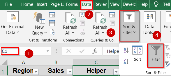
➤ Go to the Data tab and click on Filter in the Sort & Filter group. This will add dropdown arrows to your header row.
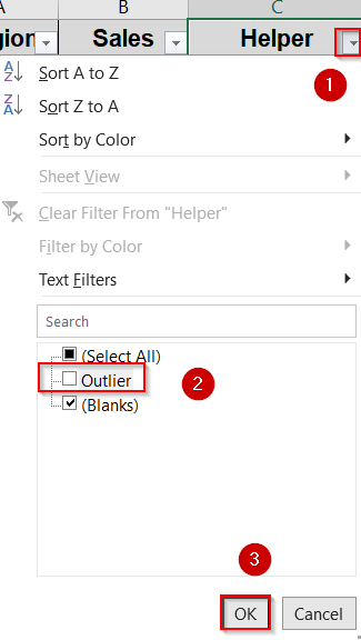
➤ Click the dropdown arrow in the Helper column that contains the “Outlier” labels.
➤ Uncheck “Outlier” so that only blank or non-outlier rows remain visible and click OK.
Your dataset now excludes the outliers from view, allowing you to analyze the cleaned data without deleting any original entries. You can re-enable them anytime by adjusting the filter.
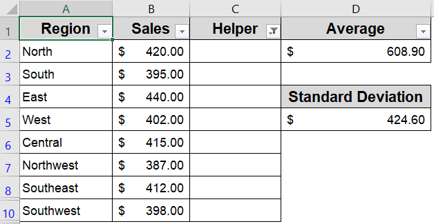
Apply the Helper Column Technique to Remove Outliers Using Standard Deviation
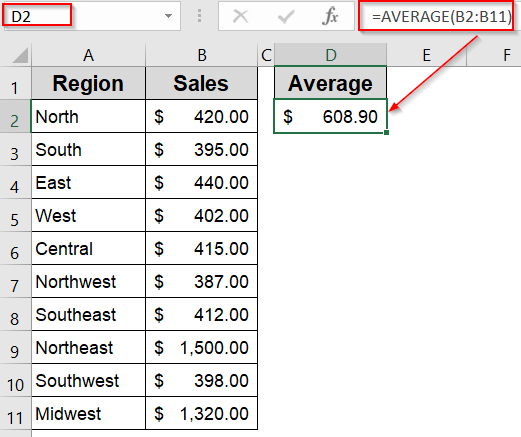
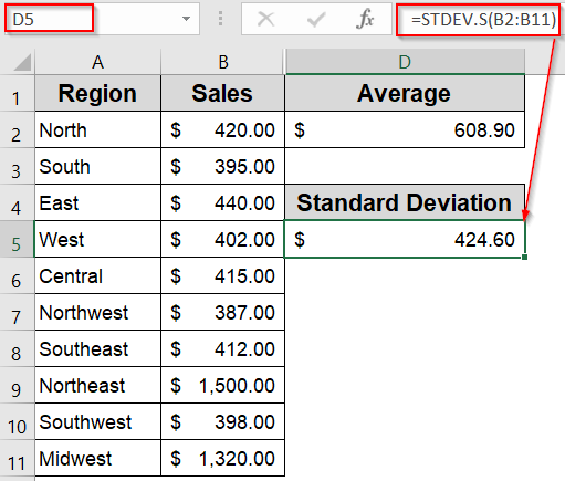
When your dataset follows a roughly normal distribution, using standard deviation is a reliable way to detect extreme values. By calculating the mean using the AVERAGE function and the standard deviation using STDEV.S (for sample data) or STDEV.P (for population data), you can determine a threshold range for acceptable values. A common rule of thumb is to flag any value that lies more than 2 or 3 standard deviations from the mean.
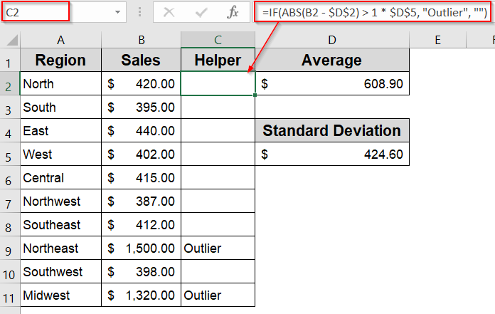
This technique becomes even more effective when combined with a helper column that automatically labels outlier rows. Once flagged, these rows can easily be filtered or removed to ensure cleaner visuals and more accurate analysis.
Steps:
➤ Use the =AVERAGE(B2:B11) formula to calculate the mean of your dataset. Place this in a helper cell, such as D2.
➤ Enter the following formula to calculate the standard deviation in D5 cell:
=STDEV.S(B2:B11)
➤ In a new column (say, C2), enter this formula to flag outliers that fall beyond 1 standard deviations from the mean:
=IF(ABS(B2 - $D$2) > 1 * $D$5, "Outlier", "")
➤ Drag the formula down to apply it to all data rows.
➤ Go to the Data tab and click on Filter in the Sort & Filter group. This will add dropdown arrows to your header row.

➤ Now apply a filter to the outlier column, uncheck “Outlier,” and view only the cleaned data for further analysis by clicking OK.

This method offers a statistical safeguard against extreme values that could skew results, especially when you’re working with symmetrical data distributions.
Frequently Asked Questions
What is the simplest way to ignore outliers when calculating average?
The easiest way is to use the TRIMMEAN function in Excel. It automatically removes a percentage of the highest and lowest values, giving you a more balanced and representative average without manually identifying outliers.
How do I spot outliers visually in Excel?
You can create a line chart, scatter plot, or box plot. Outliers typically appear as values that deviate sharply from the general trend or cluster of data, making them easy to identify with just a glance.
Can Excel automatically flag outliers for me?
While Excel doesn’t have a built-in “find outlier” tool, you can use formulas with QUARTILE, IQR, or standard deviation methods to highlight or tag data points that fall far outside the expected range.
Are outliers always bad?
Not always. Outliers can indicate data entry errors, but they can also reveal significant insights or rare events. It’s important to analyze their cause before deciding whether to keep, correct, or exclude them.
Do outliers affect Excel charts?
Yes. Outliers can skew chart scales, making other data harder to interpret. Filtering them or adjusting the axis range can improve clarity, especially when working with large datasets or visual presentations.
Wrapping Up
In this tutorial, we learned how to remove outliers in Excel using three hands-on techniques. We saw how TRIMMEAN helps reduce skew in averages, how removing rows with extreme values improves chart visuals, and how to apply IQR formulas for manual outlier detection. Whether you’re dealing with sales reports, research data, or dashboards, these methods ensure cleaner and more trustworthy results. Feel free to download the practice file and share your feedback.