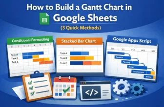
Gantt charts are essential tools for visualizing timelines, tracking project progress, and managing tasks over time. While Google Sheets doesn’t have a dedicated Gantt chart feature, you can still ...
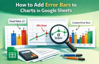
For data involving uncertainty, such as scientific experiments or survey results, error bars in charts visually represent the value range. Google Sheets allows you to add error bars to columns, bars, ...
In Google Sheets, we often need to calculate age when date of birth data is included in the dataset to determine eligibility for certain benefits or other criteria, based on age. For this purpose, ...
Sometimes, you might need to pull data directly from websites into Google Sheets. Google provides a few built-in formulas to do that. Importing data from websites into Google Sheets can be both ...
Pulling data based on criteria means extracting specific data from one sheet/tab onto another sheet or tab. This process involves using formulas that follow certain rules. Some formulas return ...
Changing the page orientation in Google Sheets is both a simple and very useful task. It lets you print any dataset in the format you prefer, which is Landscape or Portrait. For example, you’ve ...
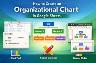
Organizational charts visualize team structures, reporting lines, and workflows in a company or project. If you manage teams or need to clarify roles and hierarchies, an org chart can save time and ...
If you’re using checkboxes in Google Sheets, for to-do lists, attendance tracking, or surveys, you might want to count how many have been checked (TRUE) or left unchecked (FALSE). Luckily, Google ...
In Excel, the date is usually formatted as the format used in the operating system. However, that format is often not enough for a lot of tasks we need to do on Excel. For better analysis of data, it ...