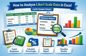
Analyzing Likert scale data is an essential part for understanding customer feedback. It allows businesses and researchers to measure the sentiment behind responses, providing a clearer picture of ...
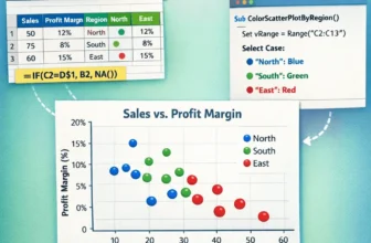
Scatter plots in Excel are useful for visualizing relationships between variables. Coloring the scatter plot based on groups, such as regions or categories, highlights patterns or trends. Let’s say ...
Scatter plots effectively visualize the relationship between two variables, vital for data analysis in business, science, and education. Microsoft Excel provides an easy way to create a scatter plot ...
A scatter plot in Excel is a powerful tool for identifying relationships between variables, analyzing data patterns, detecting outliers, conducting trend analysis, and comparing data sets. Whether ...
Combining formulas in Excel allows you to find insightful summaries, which is useful for data analysis. This article covers five easy ways to combine two formulas in Excel with proper explanation and ...
If you need to swap two rows in Google Sheets but don’t want to mess up your data or formatting, Google Sheets makes it easier. This article will show you different ways to swap rows, with or without ...
If you need to fix wrapped text, align images better, or improve the overall layout of your spreadsheet, Google Sheets makes it easier. This article will walk you through a few simple methods to ...
Microsoft Excel has genuinely two types of cell reference systems: absolute and relative cell reference. These work differently while copying or moving Excel formulas. That’s why understanding the ...
Combining text and numbers is often necessary for summaries and labels. For example, for sales data, you might need to integrate the text ‘Total’ with the sales value in numerics to show the total ...