Rounding numbers in Excel is often necessary for improving data readability and consistency, especially when working with large numerical values like measurements, financial figures or statistical ...
Swapping columns sometimes becomes a necessary task to keep spreadsheets organized when with a large dataset in Google sheets. It’s quite common for imported data to appear in the wrong order, ...
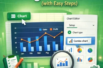
We use combo charts in Google Sheets to easily compare different types of data on one single chart. This makes spotting patterns and understanding complex information, such as sales and profit ...
Autofill form in Excel is a powerful tool that can be customized to let organizations manage deadlines, monitor task progress, track employee assignments and streamline reporting processes. By using ...
Pie charts are ideal for showing how individual categories contribute to a total, especially when visualizing survey results, spending breakdowns, or market share. But just showing percentages or ...
Pie charts are designed to show how parts of a dataset contribute to the whole. But sometimes, the default positioning of slices might make it hard to emphasize the most important category. By ...
Changing the colors of your pie chart in Excel is a simple way to improve visual clarity and align the design with your presentation or brand. Whether you want to update the entire color theme or ...
Pie charts are great for showing how individual parts contribute to a whole, but they can quickly become cluttered when too many small categories are involved. When the chart is overloaded with tiny ...
Pie charts are an excellent way to visualize how individual items contribute to a total. They’re commonly used in business reports, academic projects, or budgeting dashboards to display parts of a ...