If you’re looking to visualize data trends quickly in Excel, data bars are a simple yet effective feature. They turn plain numbers into colored bars directly within cells, making it easier to compare values at a glance without using charts. This is especially useful when dealing with performance scores, sales figures, or progress tracking in long spreadsheets.
In this article, we’ll walk you through step-by-step instructions to apply and personalize data bars in Excel, so you can make your spreadsheets more readable and visually clear.
Steps to add Data Bars using Conditional Formatting:
➤ Select your numeric range (e.g., B2:B12).
➤ Go to Home tab >> click Conditional Formatting.
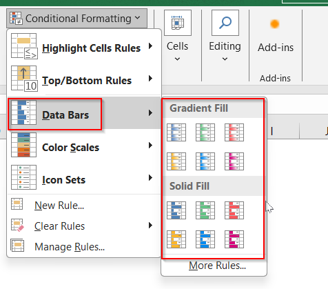
➤ Choose Data Bars >> select a Gradient Fill or Solid Fill style.
What is a Data Bar in Excel?
A Data Bar in Excel is a type of visual formatting that fills the background of a cell with a horizontal bar based on its value. The higher the number, the longer the bar appears. This lets you instantly compare numbers without needing extra charts or graphs. Excel adjusts bar lengths automatically relative to the smallest and largest values in the selected range. Data bars do not affect your data, they only enhance how it looks.
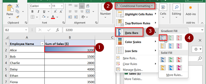
Add Default Data Bars Using Conditional Formatting
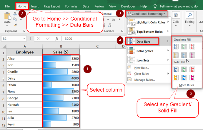
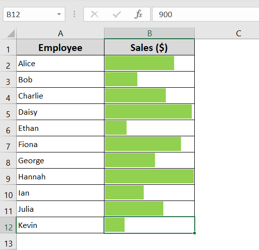
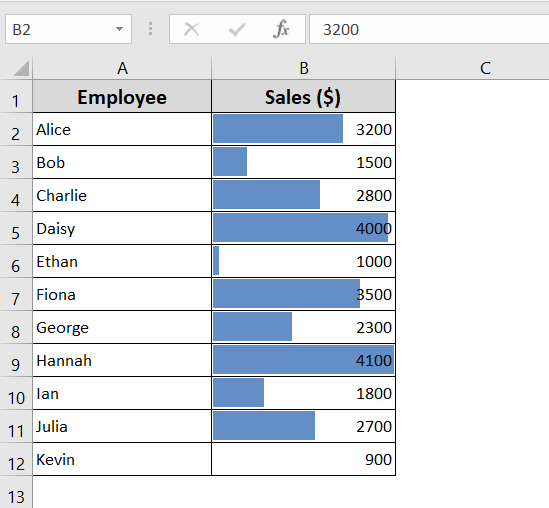
If you’re looking for a quick and easy way to add visual insights to your Excel data, the default Data Bars option is perfect. With just a few clicks, Excel automatically adds bars to each cell based on the cell’s value. Larger values display longer bars, while smaller values show shorter ones.
In this example, we’re working with a list of sales figures for different employees. The dataset includes names in one column and their corresponding sales numbers in another. This built-in option doesn’t require any advanced setup, you can just select your data range and apply the format.
Steps:
➤ Select the range of values where you want to apply data bars (e.g., B2:B12).
➤ Go to the Home tab >> click on Conditional Formatting.
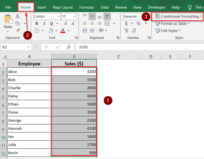
➤ Click on Data Bars.
➤ From the drop-down, pick either Gradient Fill or Solid Fill,
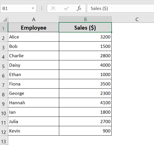
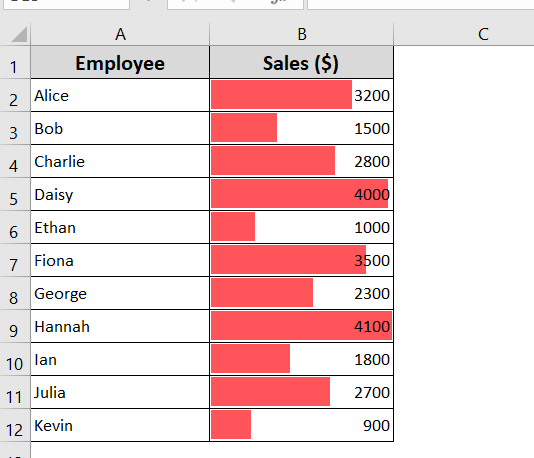
Now your selected cells will display horizontal bars that vary in length based on their value, making the data visually intuitive.
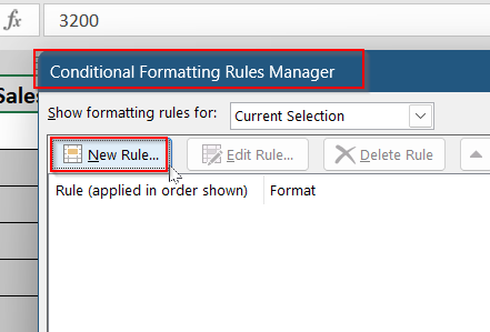
Customize Data Bars with Manage Rules Option
Sometimes, you might want your Data Bars to stand out more or better fit the look of your spreadsheet. Excel allows you to fully customize data bars through the Manage Rules option. You can change the bar color, adjust minimum and maximum value ranges, reverse bar direction, or even hide the numeric values and show only the bars.
This method gives you more control over how your data looks and behaves, especially when working with complex or sensitive datasets. It’s perfect for creating polished, presentation-ready spreadsheets.
Steps:
➤ Select the range of cells (e.g., B2:B12).
➤ Go to the Home >> Conditional Formatting >> Manage Rules.
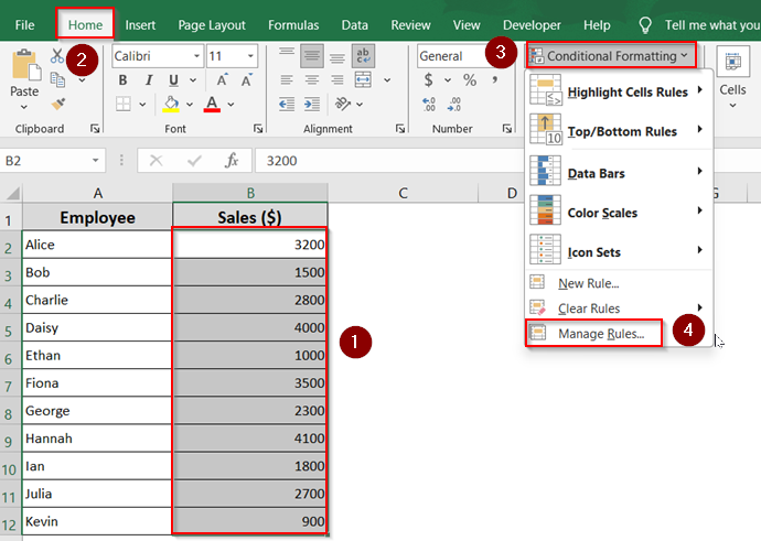
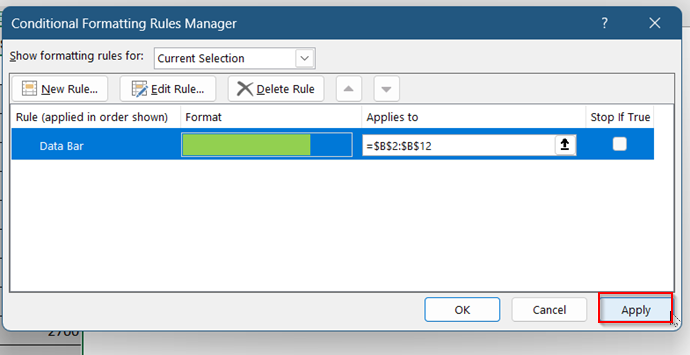
➤ In the Conditional Formatting Rules Manager window, click New Rule.
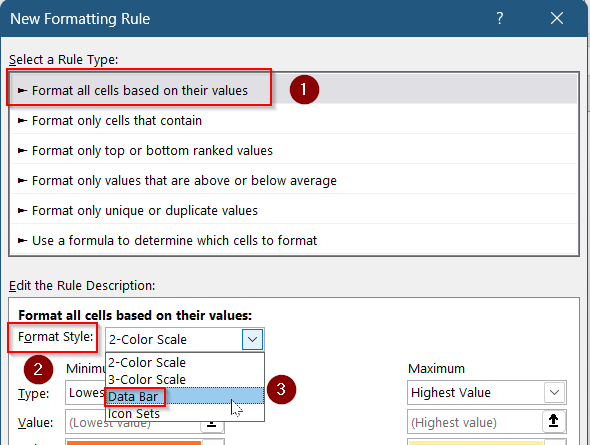
➤ Select Format all cells based on their values.
➤ In the Format Style drop-down, choose Data Bar.
➤ Under Bar Appearance, pick your preferred color. You can also adjust the Minimum and Maximum values manually.
➤ If you want to show only bars (without numbers), click on Bar Only and Click OK.
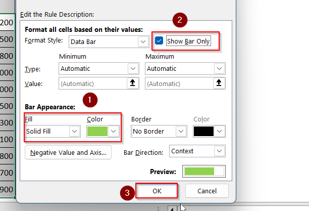
➤ Click Apply to finalize the changes.
This method is great when you’re building dashboards or want to ensure consistency across multiple datasets.
Define Minimum and Maximum Data Bars Value in Excel
By default, Excel automatically sets the minimum and maximum values when you apply data bars. However, you can take control and define these values yourself to better represent your data. This is especially useful when working with standardized scales or when you want consistent visual representation across different datasets.
Steps:
➤ Select the range of cells (e.g., B2:B12).
➤ Go to the Home >> Conditional Formatting >> Data Bars >> More Rules.
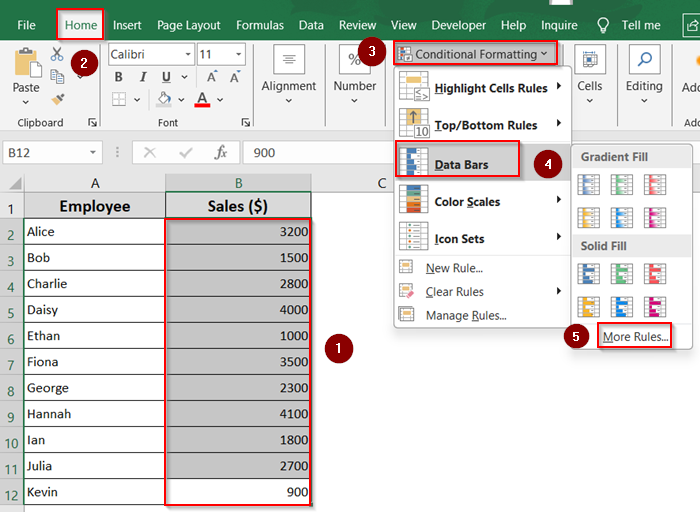
➤ Select Format all cells based on their values.
➤ In the Format Style drop-down, choose Data Bar.
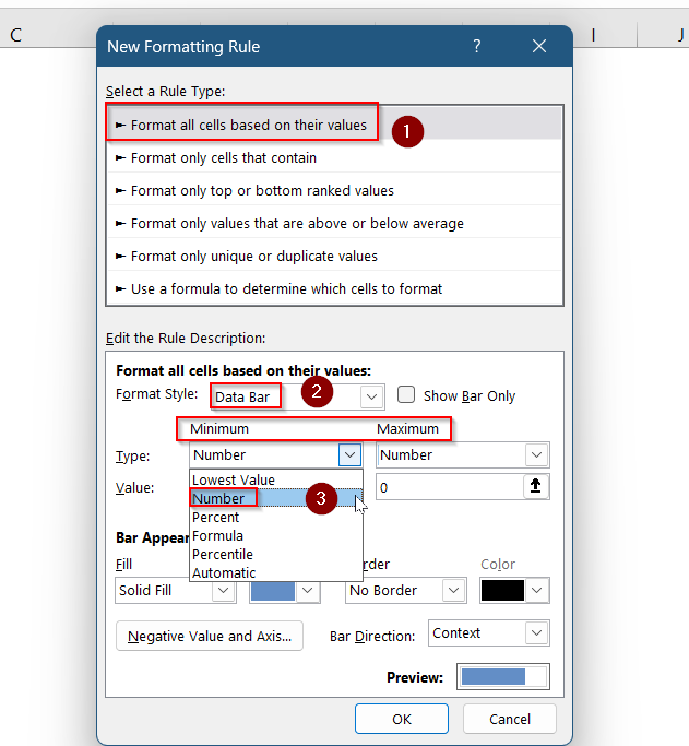
➤ In the New Formatting Rule dialog box, under Edit the Rule Description, locate the Minimum and Maximum settings.
➤ From the drop-down menus next to Minimum and Maximum, choose the type (e.g., Number).
➤ Enter your custom values. For example, set Minimum = 900 and Maximum = 4100 for a Number based scale.
➤ Click OK.
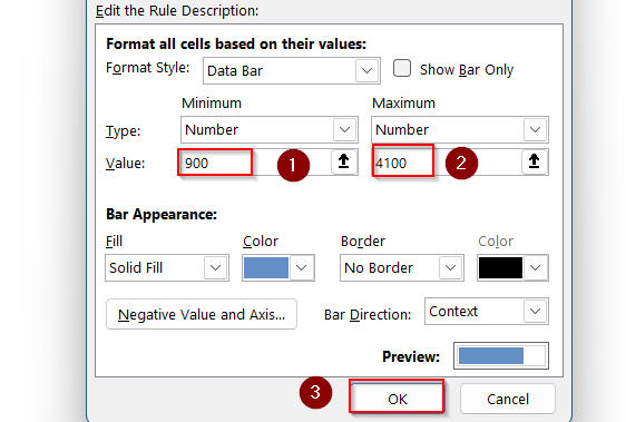
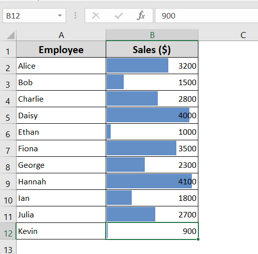
Now the updated Bars are visible in your worksheet.
Create Excel Data Bar Based on Formula
If you want more control over how your data bars appear, Excel lets you use formulas to define the Minimum and Maximum values. This method is useful for improving visualization by slightly adjusting the range, ensuring all bars are clearly visible, even the smallest and largest ones.
Steps:
➤ Select the range of cells (e.g., B2:B12).
➤ Go to the Home >> Conditional Formatting >> Data Bars >> More Rules.

➤ In the New Formatting Rule dialog box, under Edit the Rule Description, set the Minimum and Maximum types to Formula.
➤ In the Minimum formula box, enter:
=MIN($B$2:$B$12)*0.95
➤ In the Maximum formula box, enter:
=MAX($B$2:$B$12)*1.05
➤ Customize bar appearance if needed, then click OK.
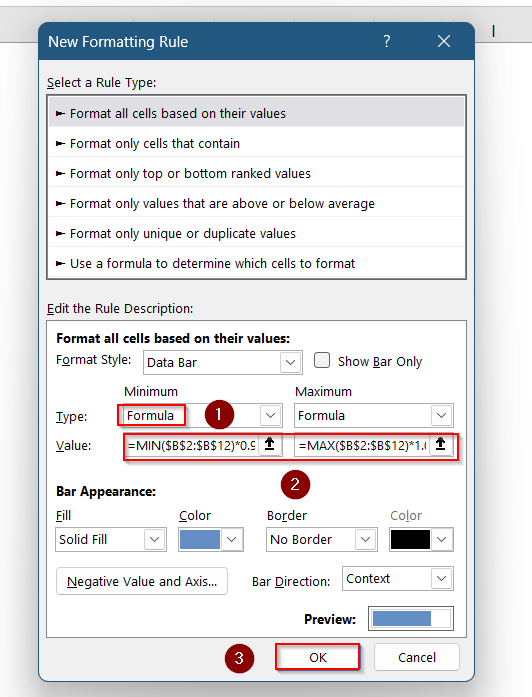
This technique is perfect for fine-tuning visual representation, especially when the dataset includes outliers or you want all values to display cleanly within the cell.
Apply Data Bars Based on Another Cell Value
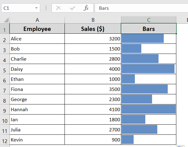
By default, Excel’s data bars apply to the same cells that contain the values. However, if you want to keep your original numbers clean and uncluttered, especially when using bold or dark colors, you can display data bars in a separate column. This simple workaround keeps your spreadsheet neat while still offering a strong visual impact.
Steps:
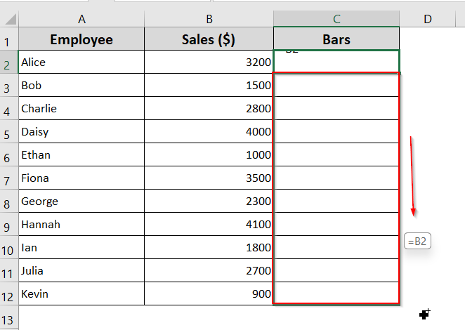
➤ Choose an empty column next to your data range (e.g., Bars).
➤ In the first cell of the new column (e.g., C2), enter the formula: =B2
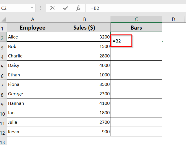
➤ Drag down to extend the formula.
➤ Select the new column with the formulas (e.g., C2:C12).
➤ Go to the Home >> Conditional Formatting >> Data Bars >> More Rules.
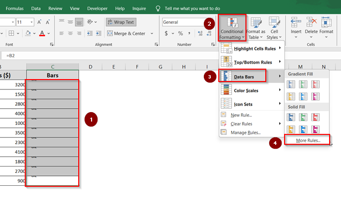
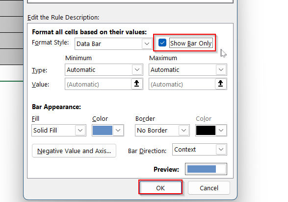
➤ In the New Formatting Rule window, tick the Show Bar Only checkbox to hide the numbers and show only the bars.
➤ Adjust bar color and other settings as needed, then click OK.
This method is especially useful when building clean dashboards or reports where visual clarity is key. It allows you to keep the numerical data visible in one column and display the bars separately for better readability.
Configure Excel Data Bars for Negative Values
If your dataset includes both positive and negative numbers, Excel allows you to visually represent them using data bars with different colors. This makes it easy to distinguish between values at a glance, such as profits versus losses or increases versus decreases.
Steps:
➤ Select the range of cells containing both positive and negative numbers (e.g., B2:B12).
➤ Go to the Home >> Conditional Formatting >> Data Bars >> More Rules.

➤ Under Bar Appearance, choose the color for positive data bars.
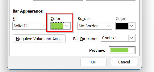
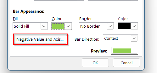
➤ Click the Negative Value and Axis button.
➤ In the Negative Value and Axis Settings dialog box, choose a Fill Color.
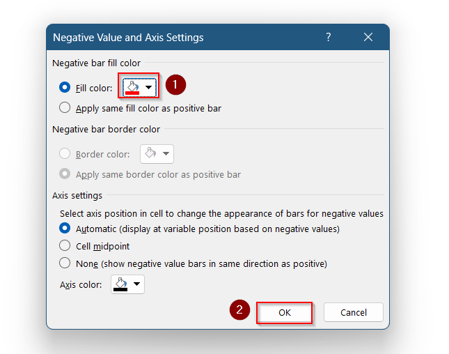
➤ Click OK to save your changes.
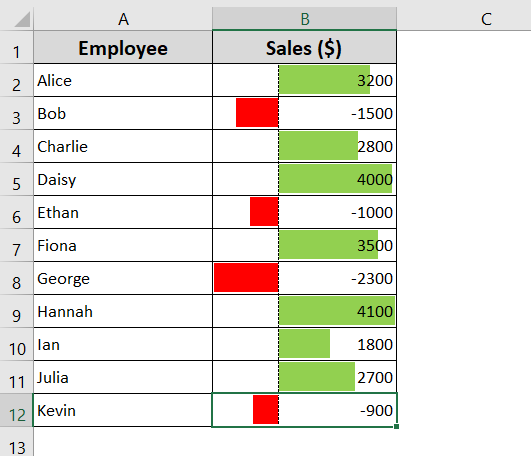
This approach helps you quickly identify negative values while keeping your dataset visually balanced and easy to interpret.
Conditionally Format a Pivot Table With Data Bars
Data Bars are a powerful visual tool in Excel that help you quickly compare values at a glance. When used in a Pivot Table, they visually represent the magnitude of values without the need for additional charts or graphs. Excel offers both Gradient Fill and Solid Fill styles, with options to customize colors and value types for more control.
Steps:
➤ Click on any value cell (e.g., B2) inside your Pivot Table.
➤ Go to Home >> Conditional Formatting >> Data Bars >> Gradient Fill.
➤ For better clarity, click the Formatting Options icon and choose the third option to apply formatting to the entire table while excluding the total row and column.
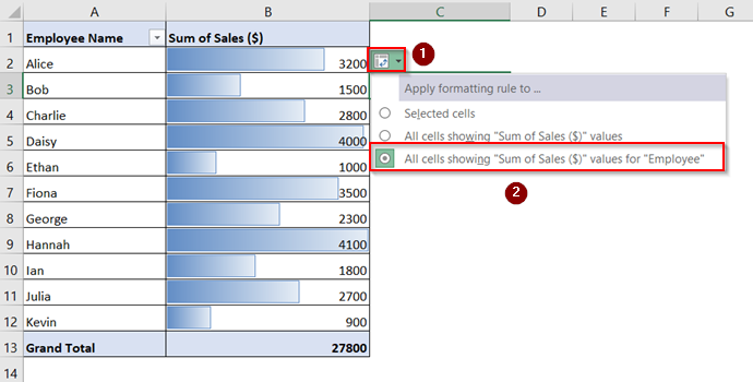
Now, your Pivot Table will display data bars across all values without being skewed by totals. This provides a clearer and more accurate visual comparison of the data.
Frequently Asked Questions
Can I apply data bars to negative numbers in Excel?
Yes, Excel supports data bars for negative values. These bars extend to the left, while positive values extend to the right. You can customize their appearance, including color and axis, using the Manage Rules >> Edit Rule option.
How do I remove data bars once applied?
Go to Home >> Conditional Formatting >> Clear Rules, then choose to remove rules from selected cells or the entire sheet. This removes only the formatting, not the values. You can also manage or delete specific rules via Manage Rules.
Can I apply data bars to non-numeric cells?
No, data bars only work with numeric data like integers or decimals. If you apply them to text or blank cells, nothing will appear. Make sure your column contains valid numbers for data bars to display properly.
Wrapping Up
In this tutorial, we learned how to add data bars in Excel using Conditional Formatting. We covered how to apply default bars, customize them using Manage Rules, and even base them on formulas or separate columns.
You also saw how to work with negative values and apply data bars inside Pivot Tables for a cleaner, visual analysis. Feel free to download the practice file and share your thoughts and suggestions.