Gathering survey data is the first step. The true value lies in tabulating the results, which transforms the raw data into meaningful and useful insights. In this article, you’ll learn about ...
In Google Sheets data, we often need to calculate the months between two dates to track the payment cycle, project timelines, or determine an employee’s seniority. To calculate this, we can use the ...
When we need to simplify our data or obtain standardized estimates, we often round up the data to the nearest 10. To do it in Google Sheets, we can use the ROUNDUP and CEILING functions. Here, we ...
Bar charts are a great way to compare different categories in Excel, and sorting the bars from largest to smallest makes it easier to see the top values right away. But Excel doesn’t have a direct ...
When you're working with data in Excel, bar charts are a great way to compare values across different categories. They're especially useful for showing totals, counts, or any kind of grouped ...
When working with sales, survey data, or any comparison-based dataset, it’s often helpful to display two related data series side by side. A double bar graph, also known as a clustered column or ...
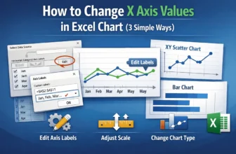
The X-axis in Excel charts plays a crucial role in organizing and displaying your data visually whether you're working with categories, dates, or numerical values. Depending on your dataset, you ...
The AVERAGEIF function in Excel is an effective tool for calculating the average of cells that meet a specific condition. In many real-world datasets, you often need to exclude zero values, ignore ...
When analyzing data in Excel, calculating percentages can give you a better understanding of proportions, trends, or distributions. With the COUNTIF function, you can quickly find out how much of ...